Melody is a cocktail bar that pulls you out of the everyday. Live classical music, cocktails with unique flavors, and a room worth dressing up for.
Melody is a cocktail bar that pulls you out of the everyday. Live classical music, cocktails with unique flavors, and a room worth dressing up for.
The branding process started from the idea of a night that does not feel entirely real. The focus goes soft, the outfits run a bit extravagant, the cocktails glitter. Every one of those choices pushes the same feeling: that you left the ordinary somewhere behind you.
We started by asking, what matters more? The classic elegance of fine dining or the impulsive, raw feeling of the moment

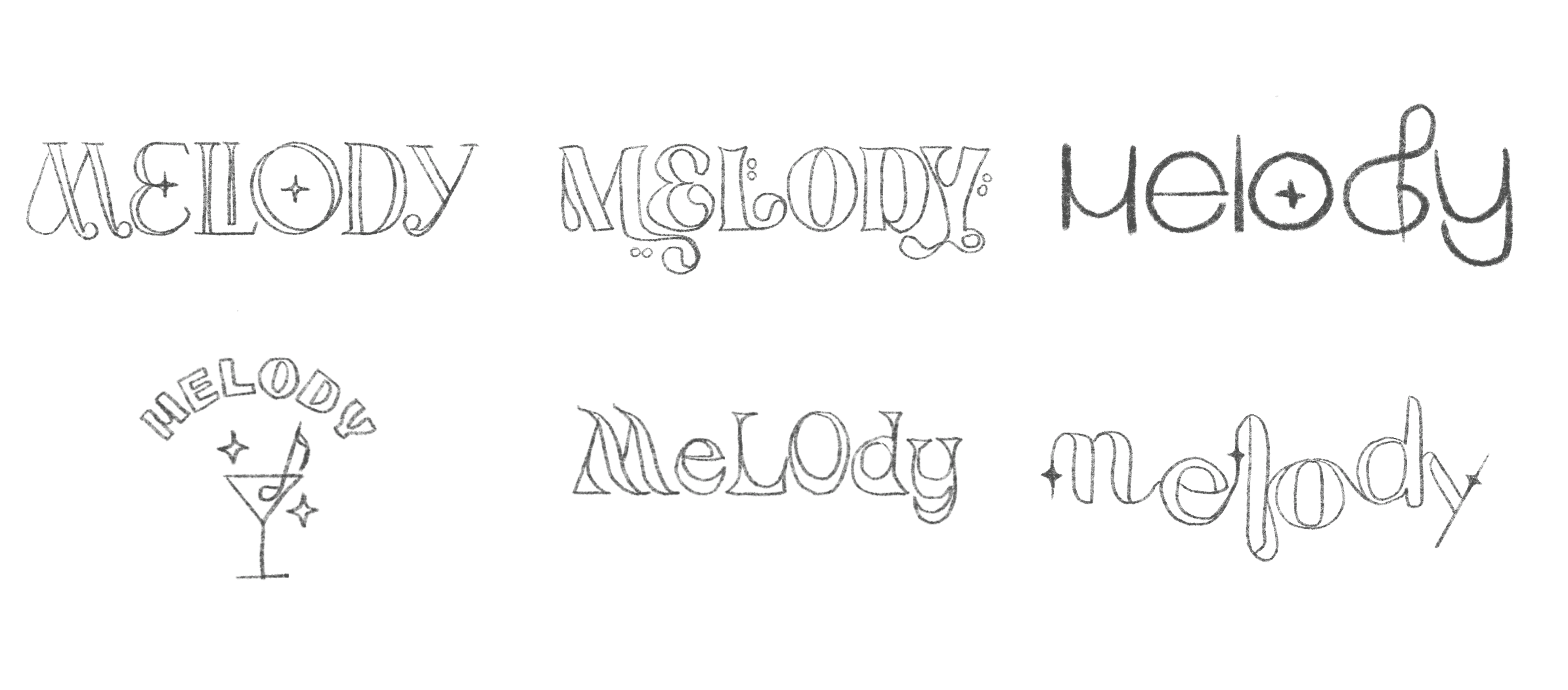
In the sketches, I kept circling ways to bring music and classic form together in one mark. I drew lines that curve like a treble clef, played with the weight of each stroke, and looked for a rhythm that feels like the music you hear when you walk in.
In the sketches, I kept circling ways to bring music and classic form together in one mark. I drew lines that curve like a treble clef, played with the weight of each stroke, and looked for a rhythm that feels like the music you hear when you walk in.
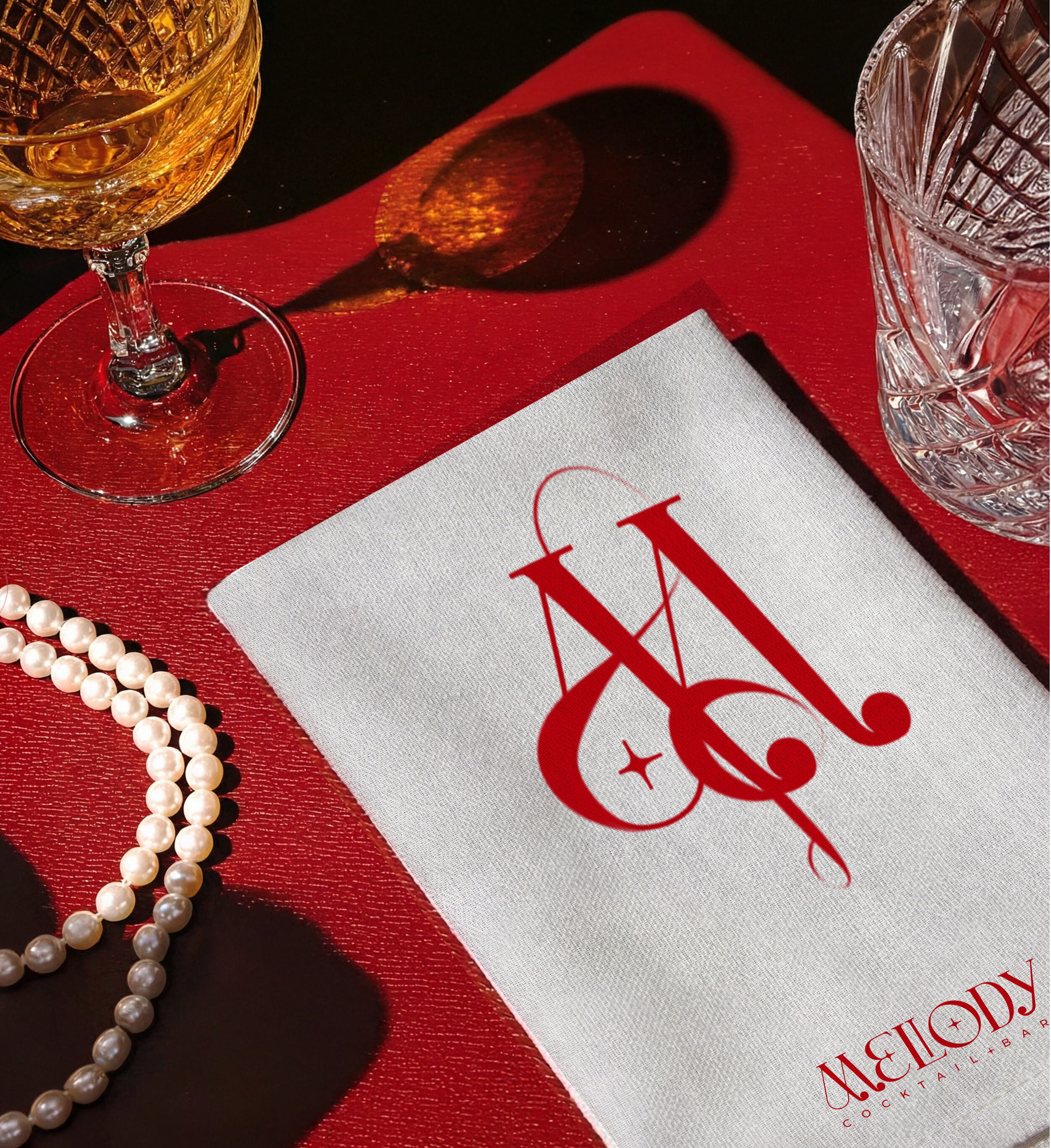
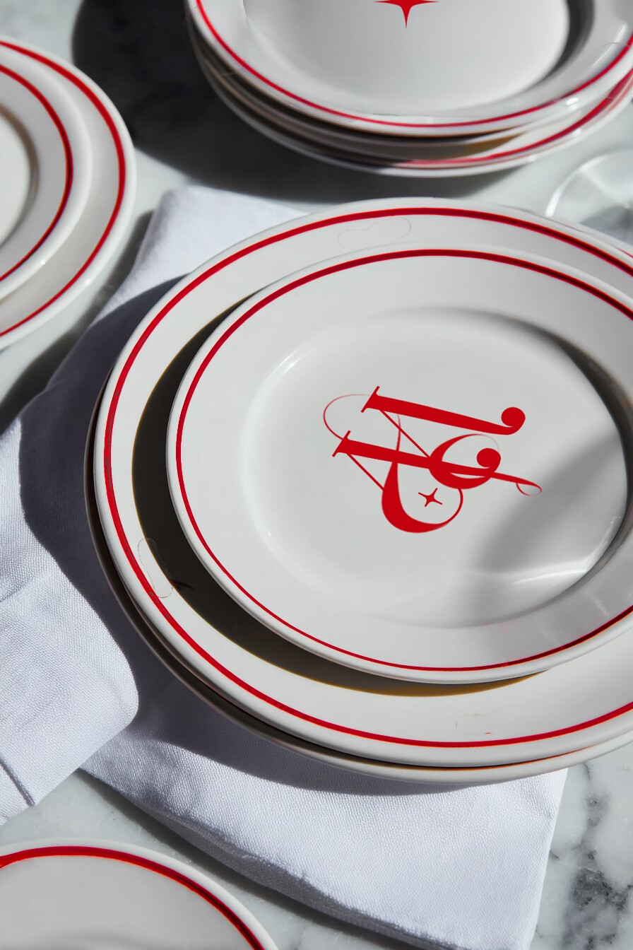
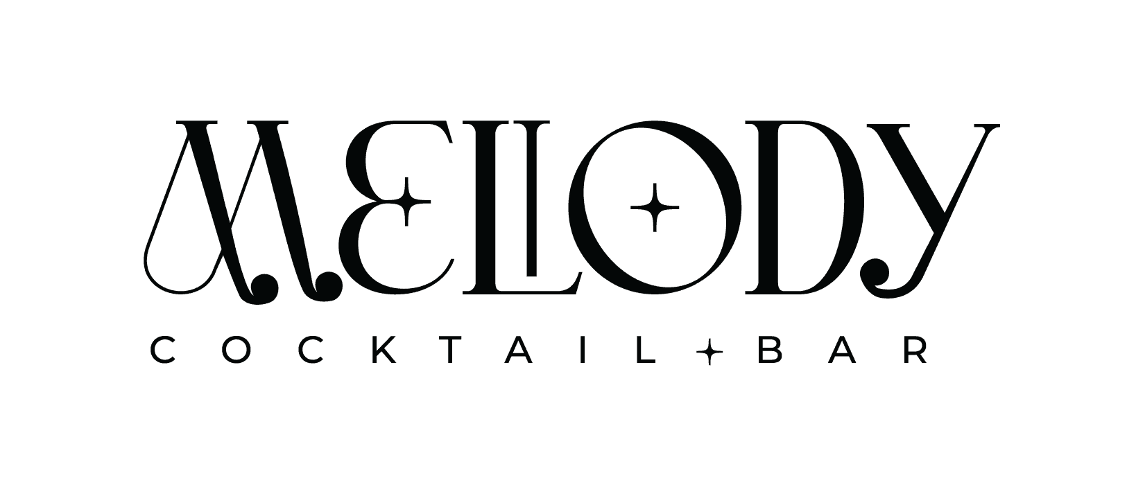
For the logo I chose a classic typeface as the base, then added circular details that echo the shape of musical notes. The structure stays tight, but the curves give it movement, so the logo feels like it's in motion, not fixed on the page.
A classic font paired with circular details and musical elements. The structure stays refined, but the curves and notes break the rigidity, adding flow and rhythm.
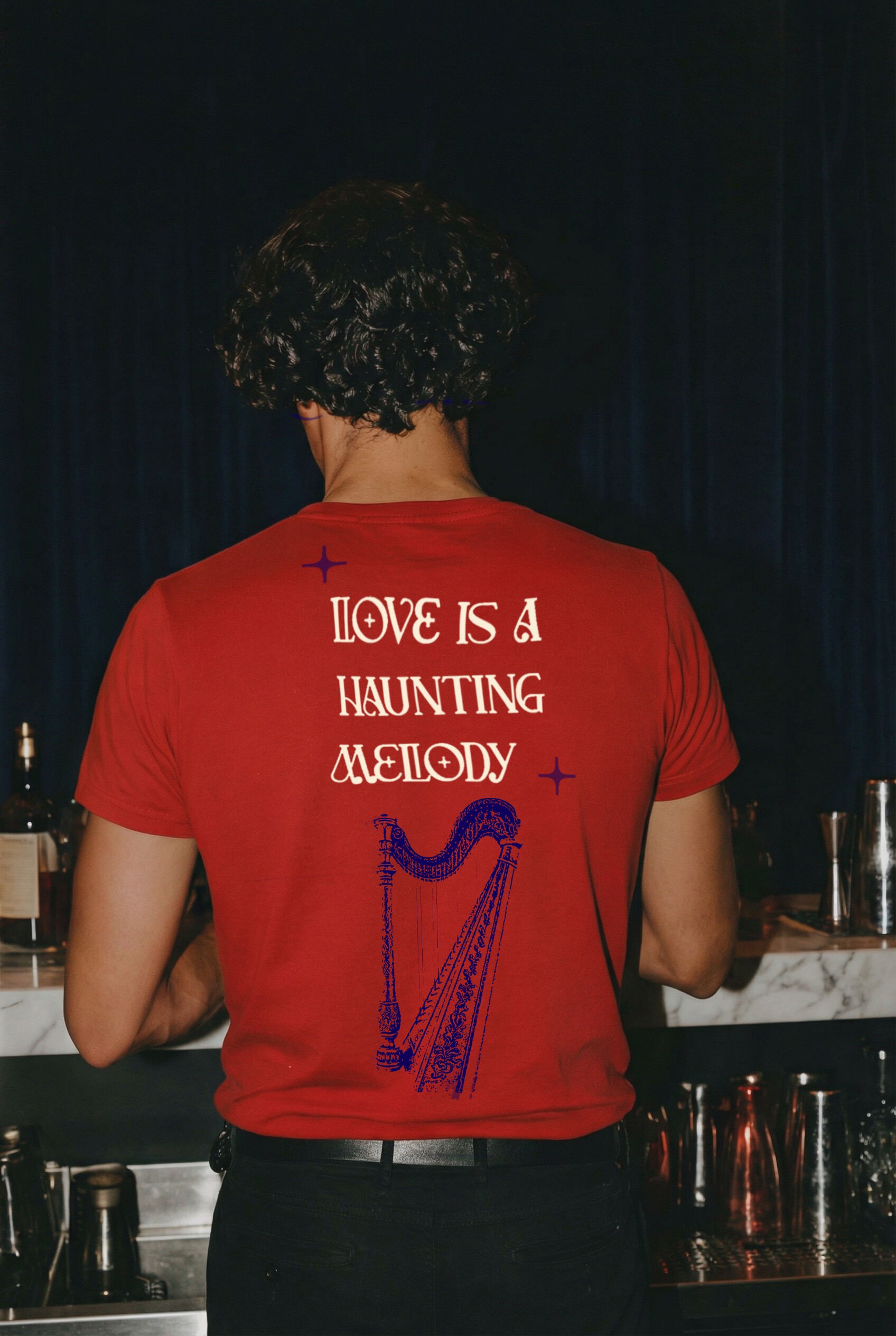
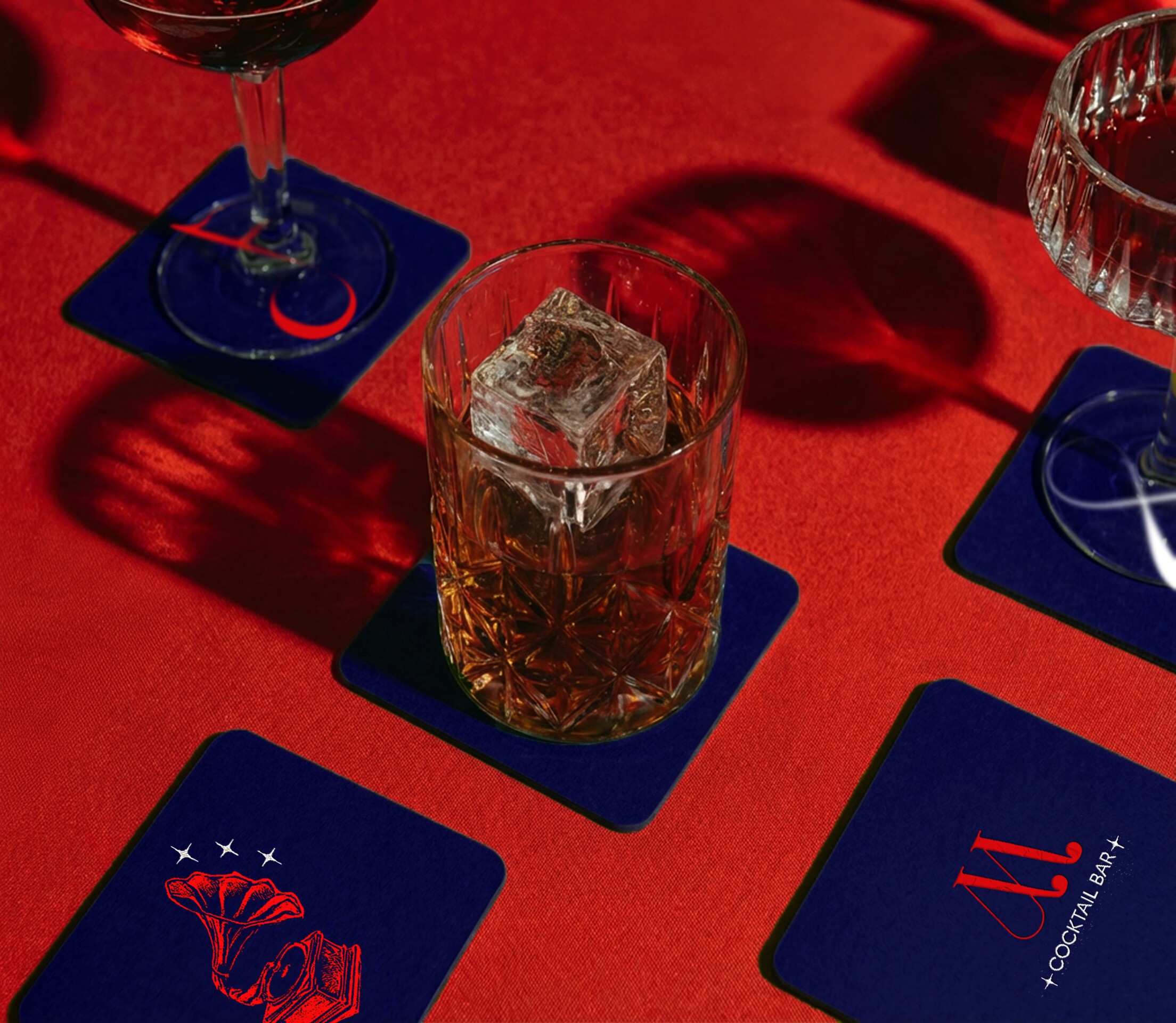
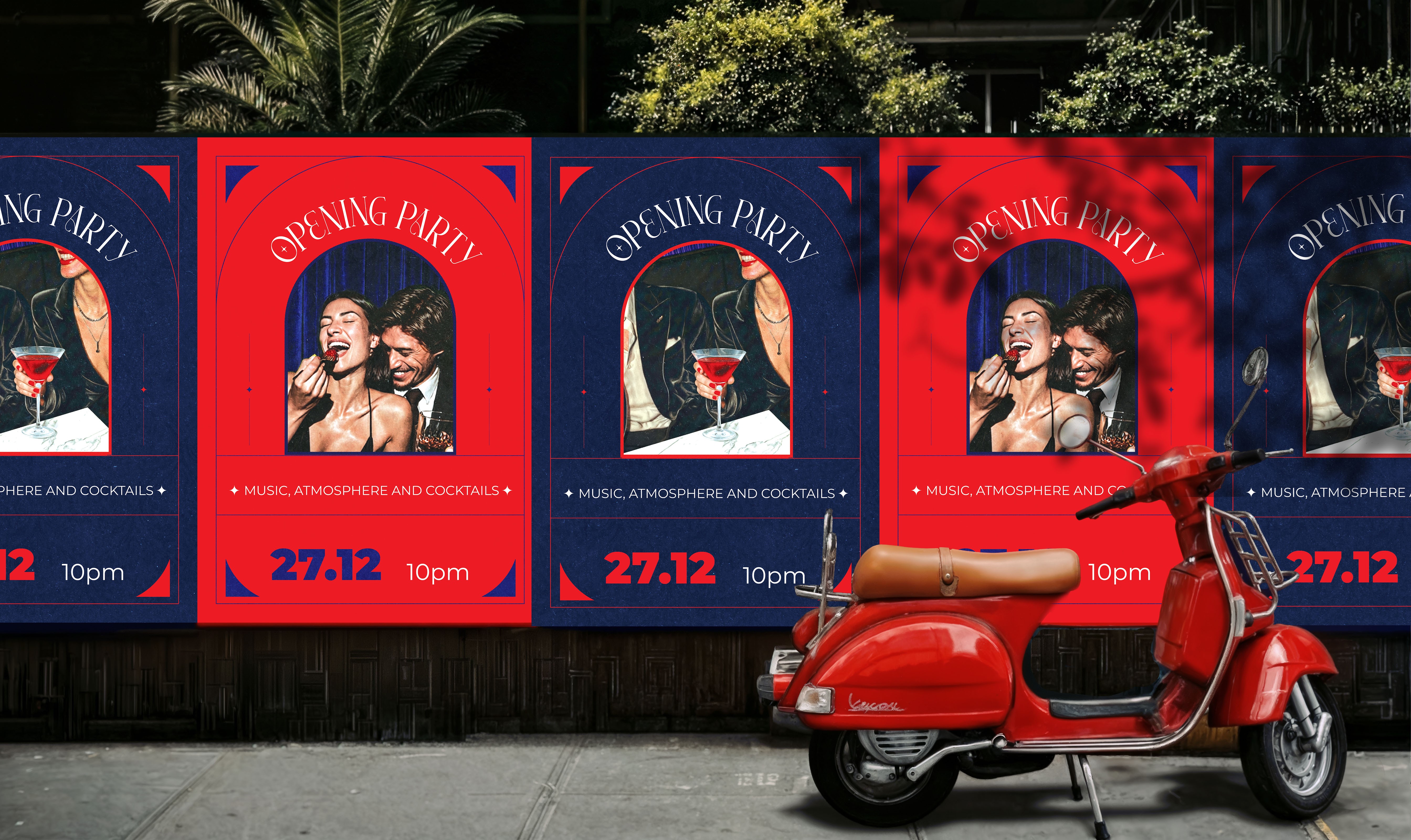
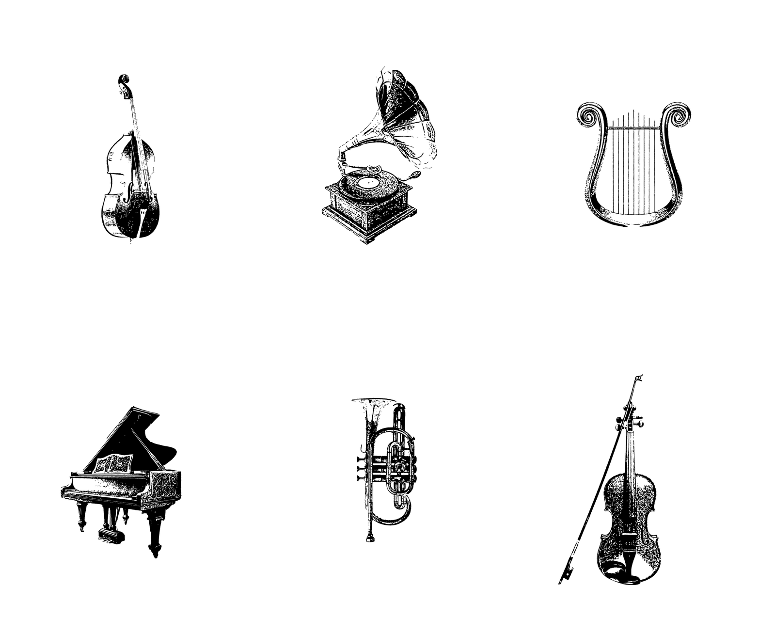
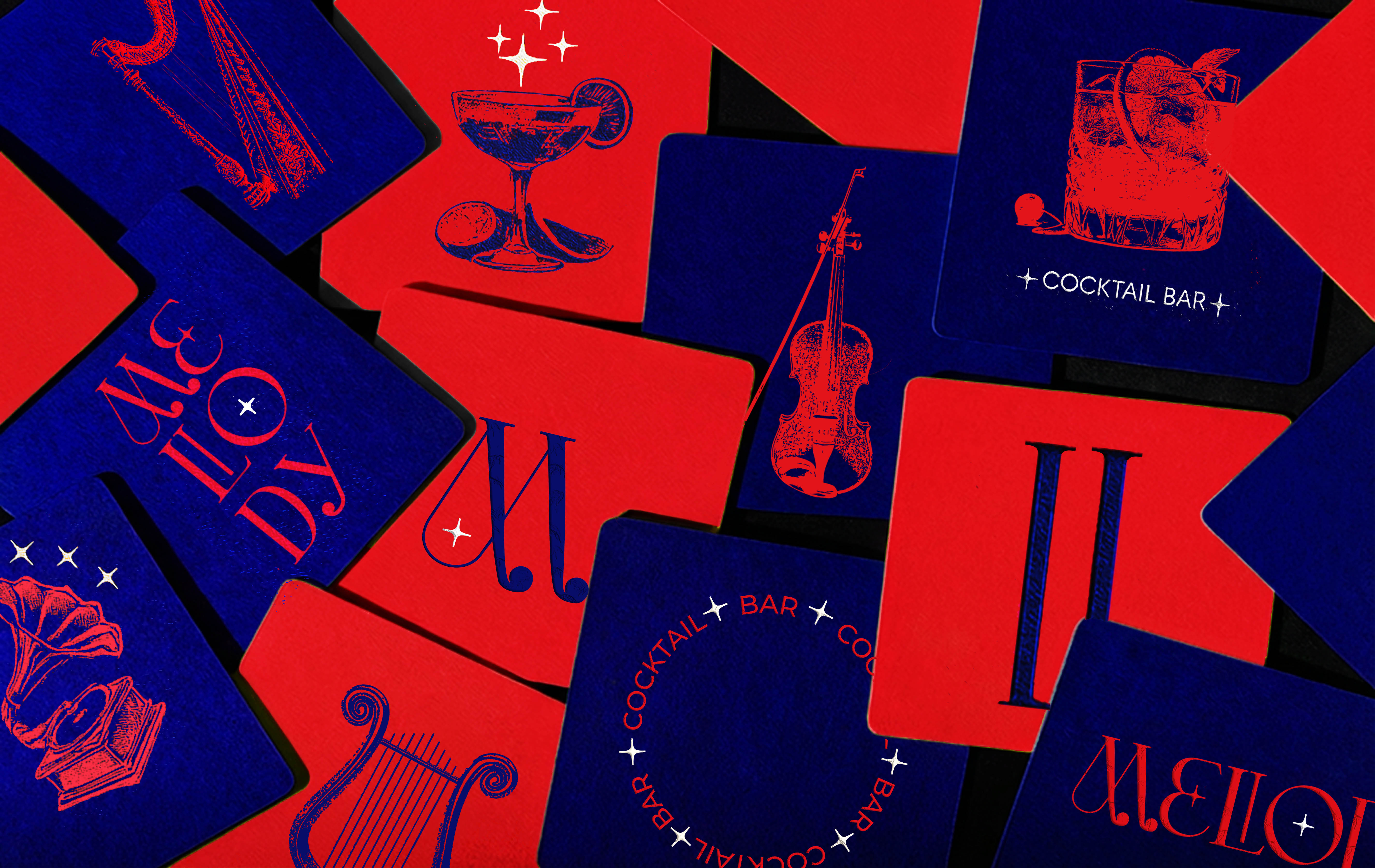
I worked with real objects, musical instruments, and cocktails, photographed and manipulated to look like screen printing. Not illustrations, the actual things. The result feels both nostalgic and current, old romance with a modern edge. These visuals will appear across the brand: on menus, coasters, signage, and ads, so the identity shows up everywhere guests look.
I worked with real objects, musical instruments, and cocktails, photographed and manipulated to look like screen printing. Not illustrations, the actual things. The result feels both nostalgic and current, old romance with a modern edge. These visuals will appear across the brand: on menus, coasters, signage, and ads, so the identity shows up everywhere guests look.

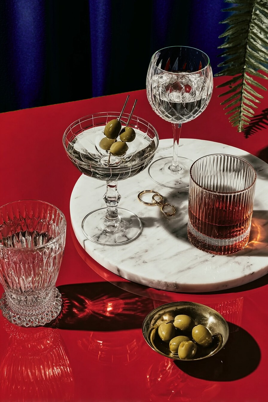
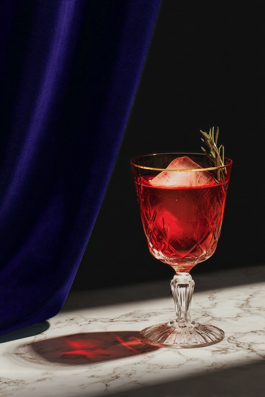
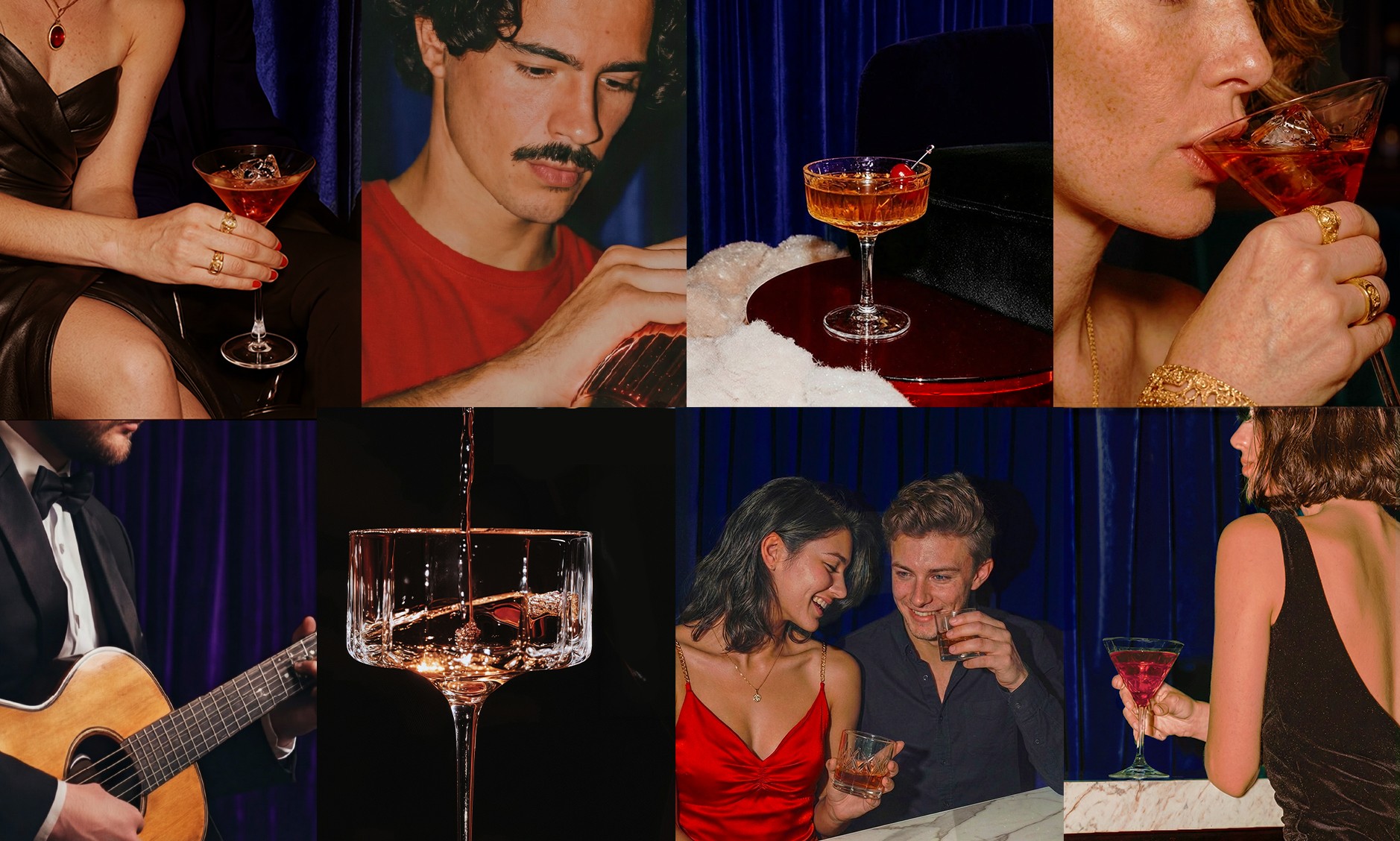
The photography works in close-ups that build mystery and romance. Everything feels a little dreamlike, slightly unreal. The colors deepen the sensual, cinematic mood of the place
The photography works in close-ups that build mystery and romance. Everything feels a little dreamlike, slightly unreal. The colors deepen the sensual, cinematic mood of the place

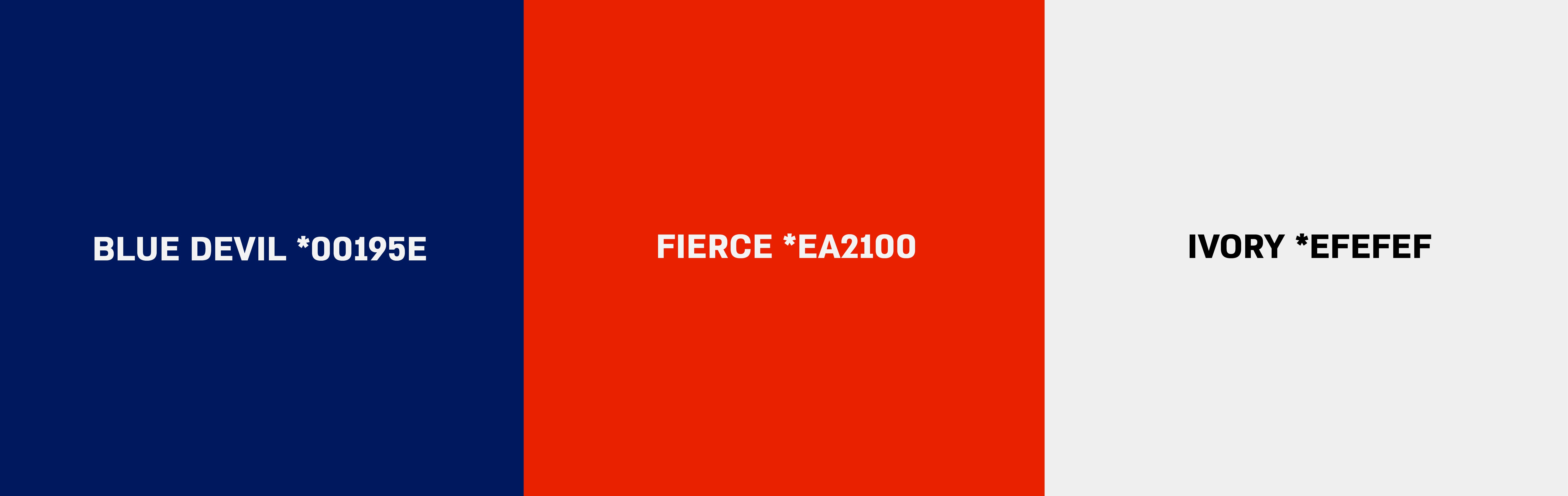
Red brings passion and emotional intensity. Indigo keeps it calm, grounded, and classic.
Red brings passion and emotional intensity. Indigo keeps it calm, grounded, and classic.
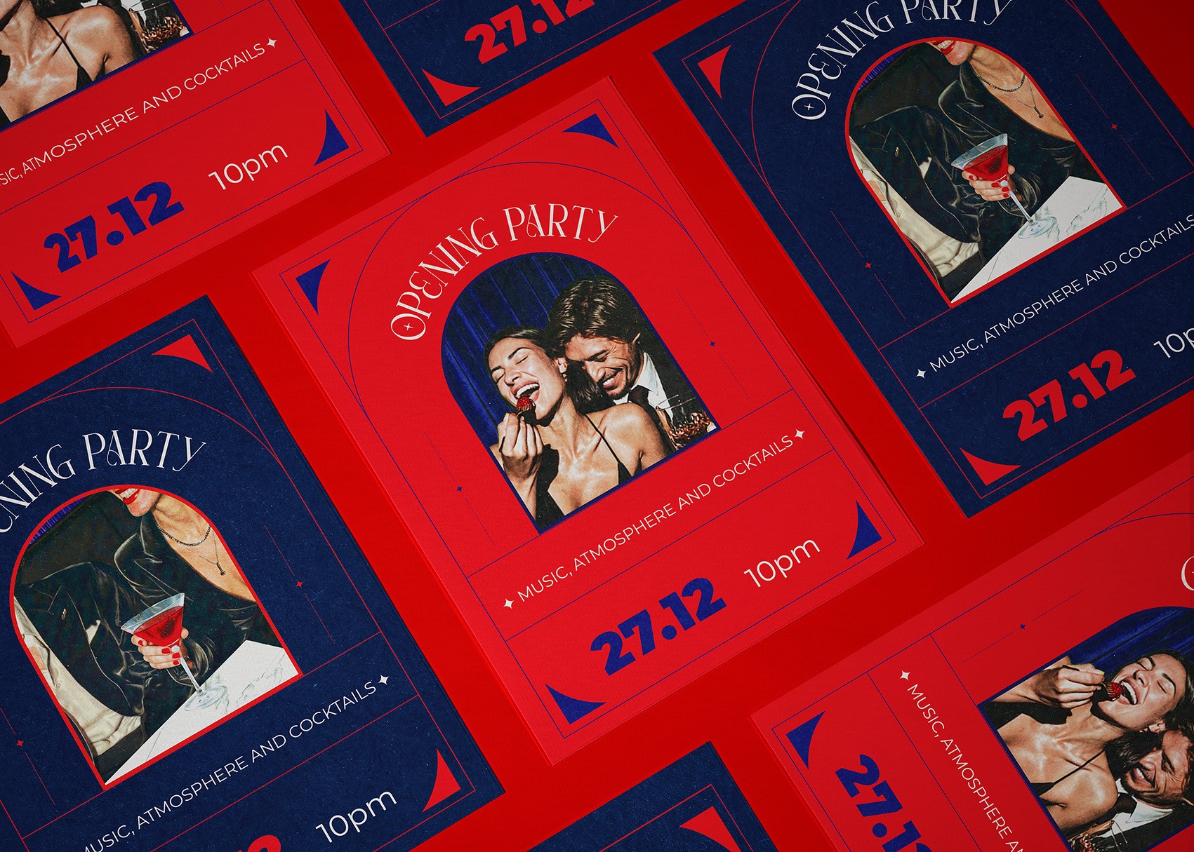
On social, the photography and the graphic language meet to build mystery. Tight close-ups on a hand, a glass, a detail, never the whole room. Over them, the red instruments and red type move through the frame and make everything feel more vivid, a step outside reality. The less you see, the more your own imagination fills in, so the feed holds something back on purpose. It does not flatter you or try to convince you to come. That distance is what makes it pull.
The content hints rather than shows. close-ups that create mystery and romance. Everything feels slightly fantastical, almost dreamlike. The colors intensify Melody's sensual, cinematic atmosphere.