Gallery is a fine dining restaurant for guests who want to feel like they are part of something rare, a moment that exists only here, only now. These are curious, well-traveled people with a real eye for art and craft, the kind who look for originality and a personal experience over routine luxury. Every plate is made by hand, in the moment, so no two are ever exactly alike. I wanted that promise to come through before anyone even books a table, and then to be real the second they walk in.
Gallery is a fine dining restaurant where every dish is crafted with the intention, artistry, and creativity of a work of art. The guest who chooses Gallery wants to feel like they're part of something rare, a one-of-a-kind moment that exists only here, only now.
The branding process started with a question I kept circling to: does fine dining have to feel formal, or can it feel like watching an artist work? I filled the board with expressive ink portraits, chefs' hands mid-plating, and dishes shot like still lifes. Artful and a little raw, food treated as something closer to art than to product.
We started by asking, what matters more? The classic elegance of fine dining or the impulsive, raw feeling of the moment

Once I had the tension, I went to the sketches to find its shape. I kept asking how to bring classic refinement and a loose, expressive hand together in one mark, so it feels composed and alive at the same time.
We started by asking, what matters more? The classic elegance of fine dining or the impulsive, raw feeling of the moment
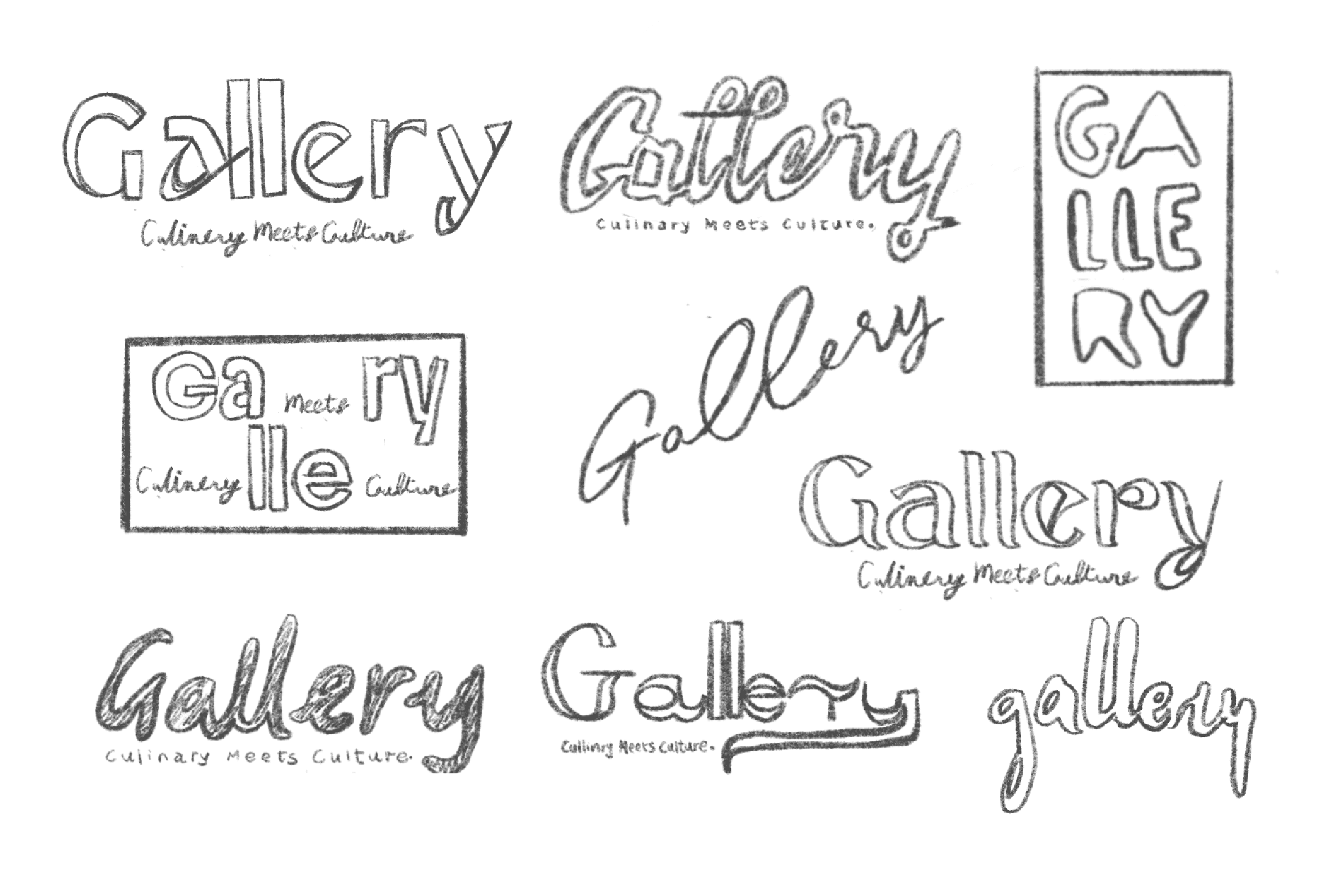
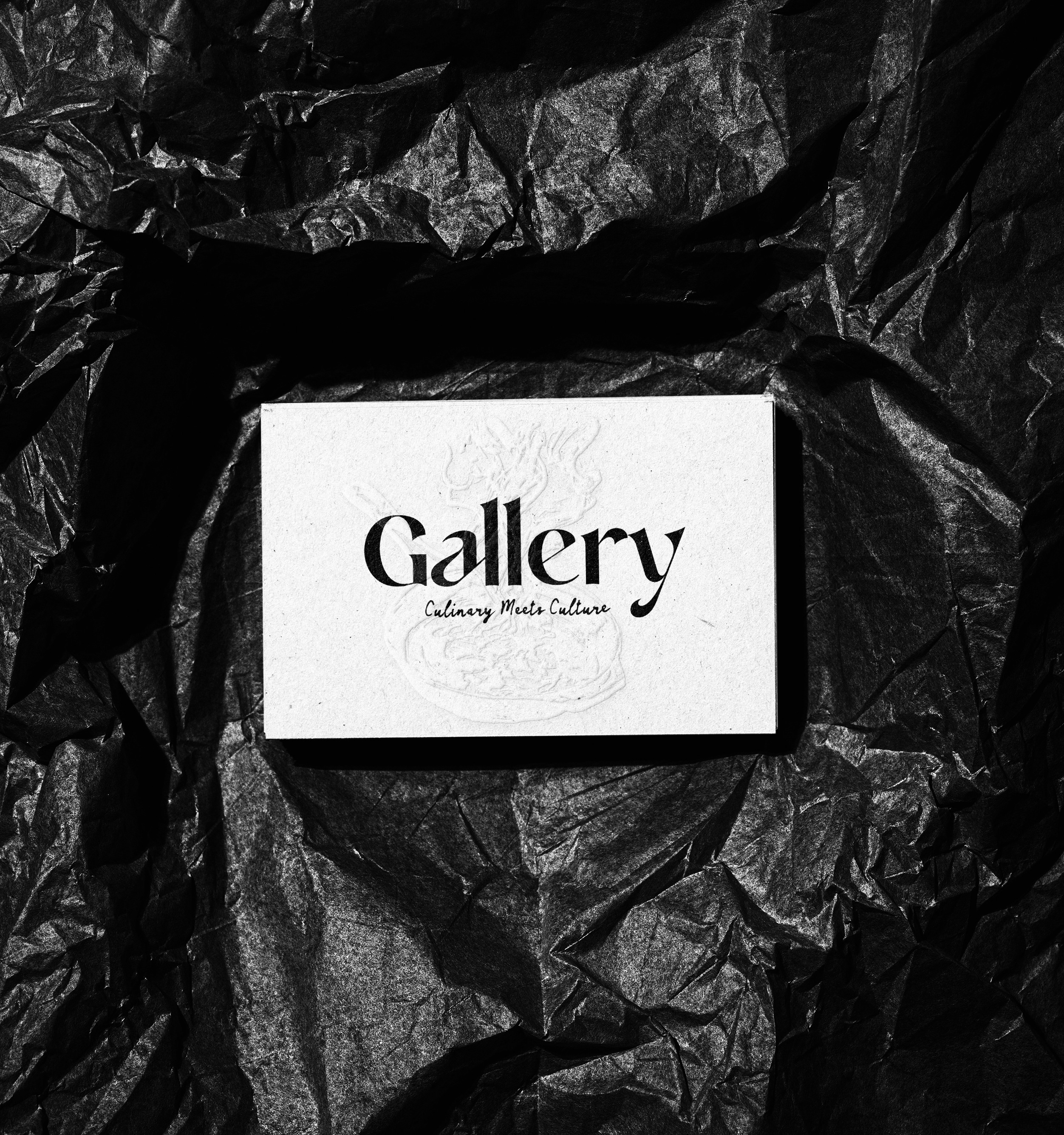
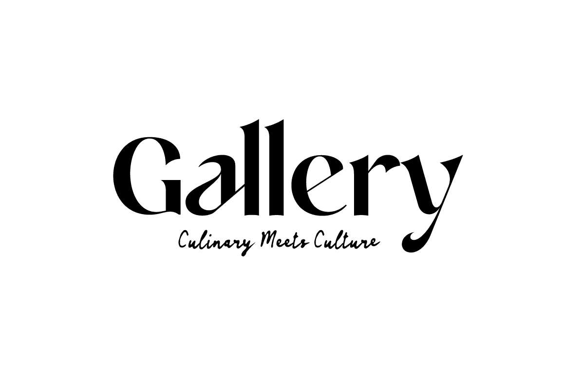
The logo is the first thing you see. I put the classic side up front, and kept the expressive side as the second voice.
The logo is the first thing you see. I put the classic side up front, and kept the expressive side as the second voice.
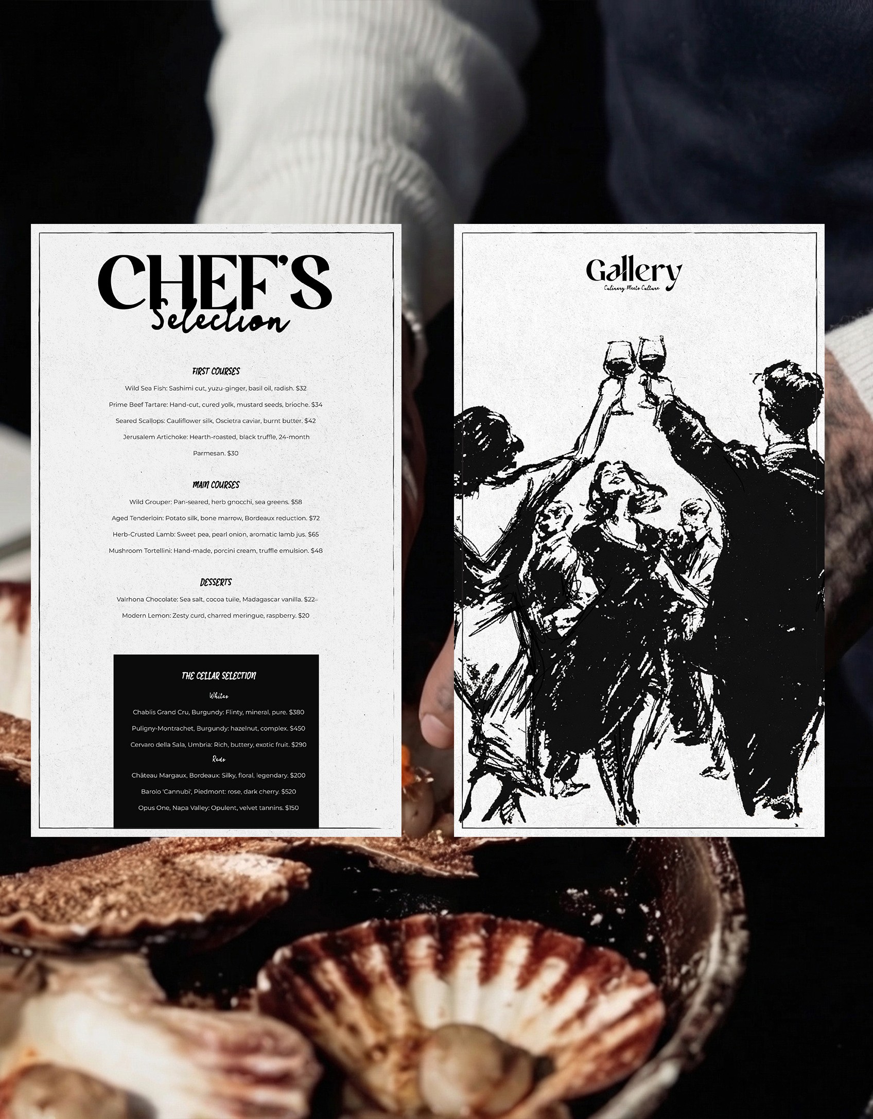
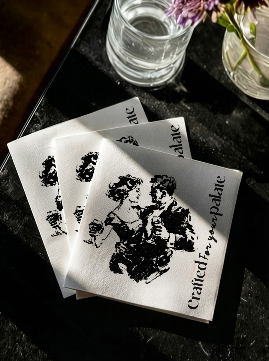
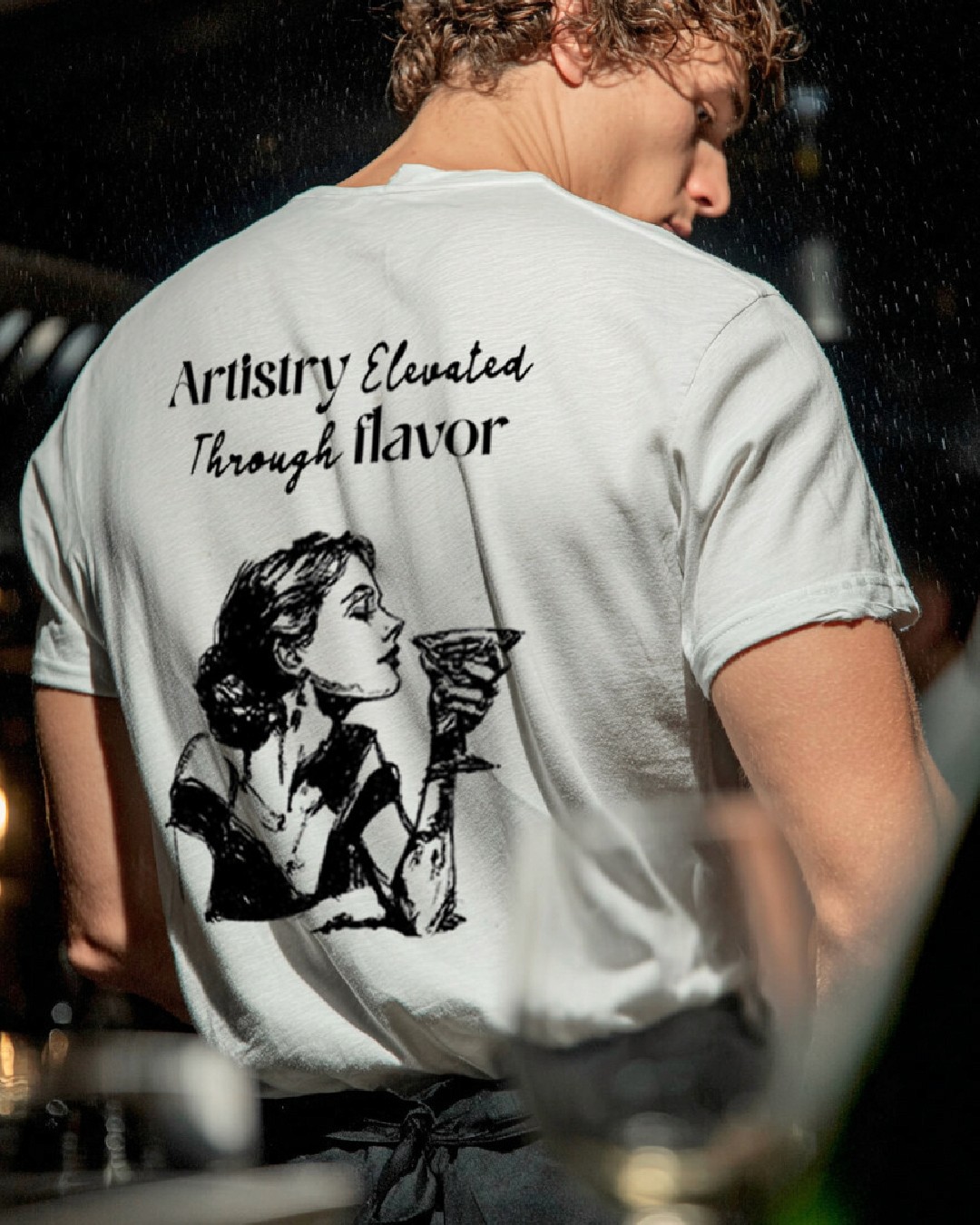
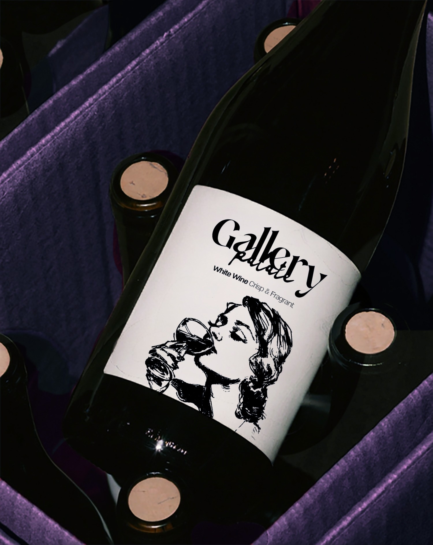
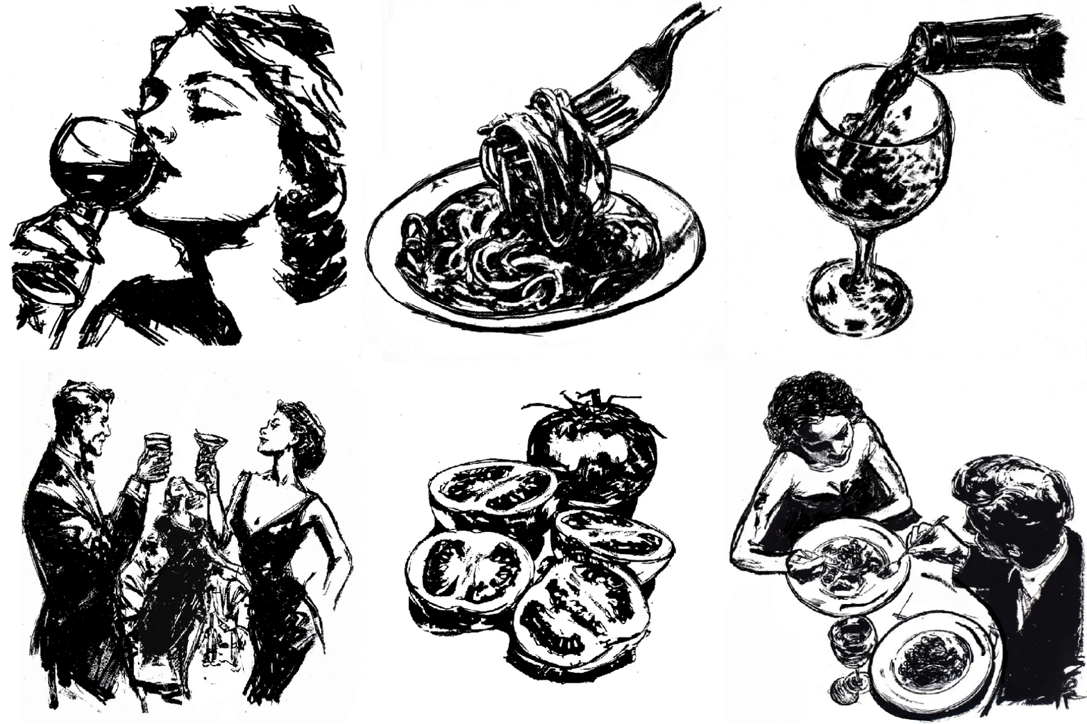
The visual language is hand-drawn ink, loose and expressive, with real passion in the line itself. The illustrations show people eating and celebrating, so you get the real atmosphere of the room: the food, the drinks, the talking, and the pleasure of a good evening.
The visual language is hand-drawn ink, loose and expressive, with real passion in the line itself. The illustrations show people eating and celebrating, so you get the real atmosphere of the room: the food, the drinks, the talking, and the pleasure of a good evening.
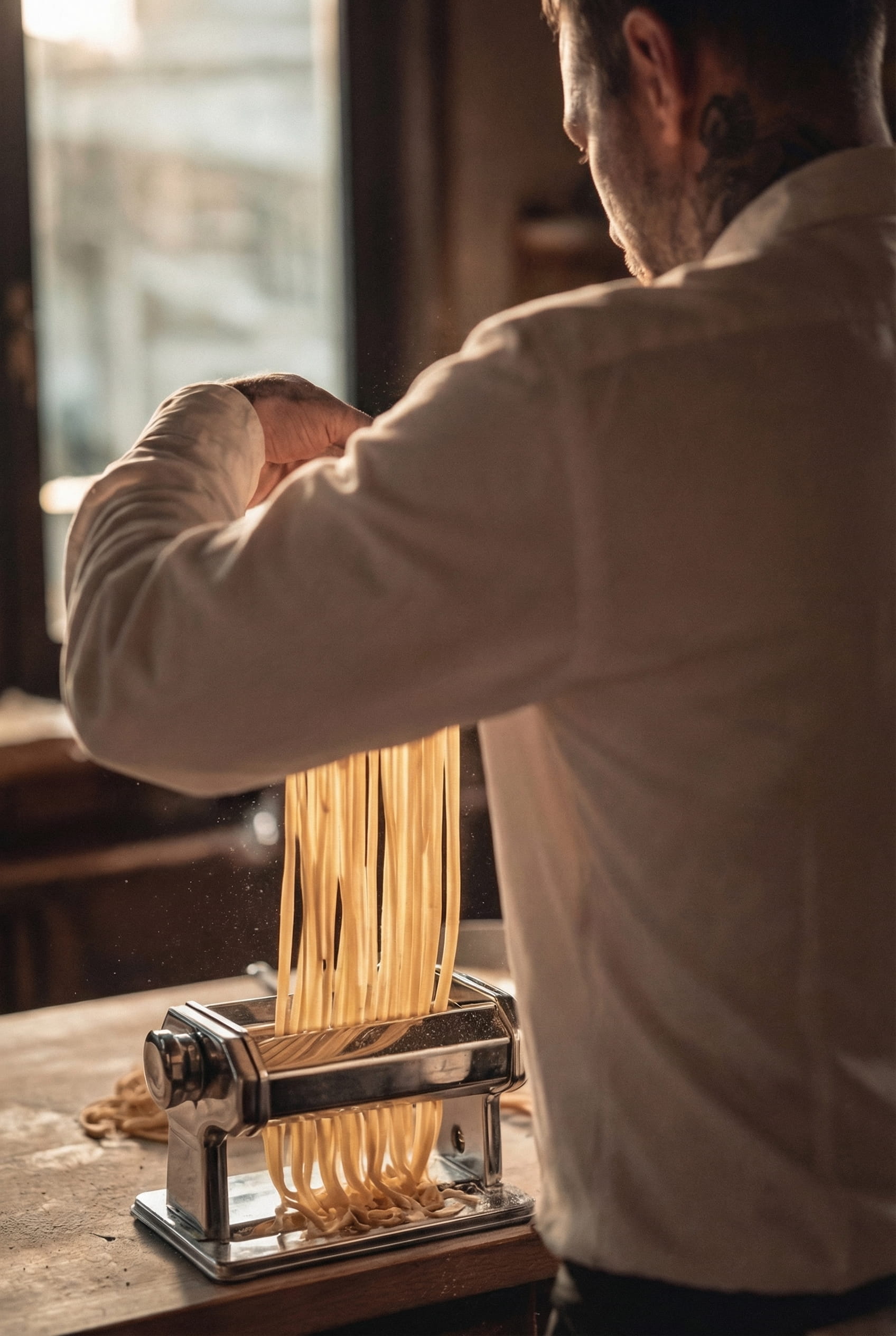
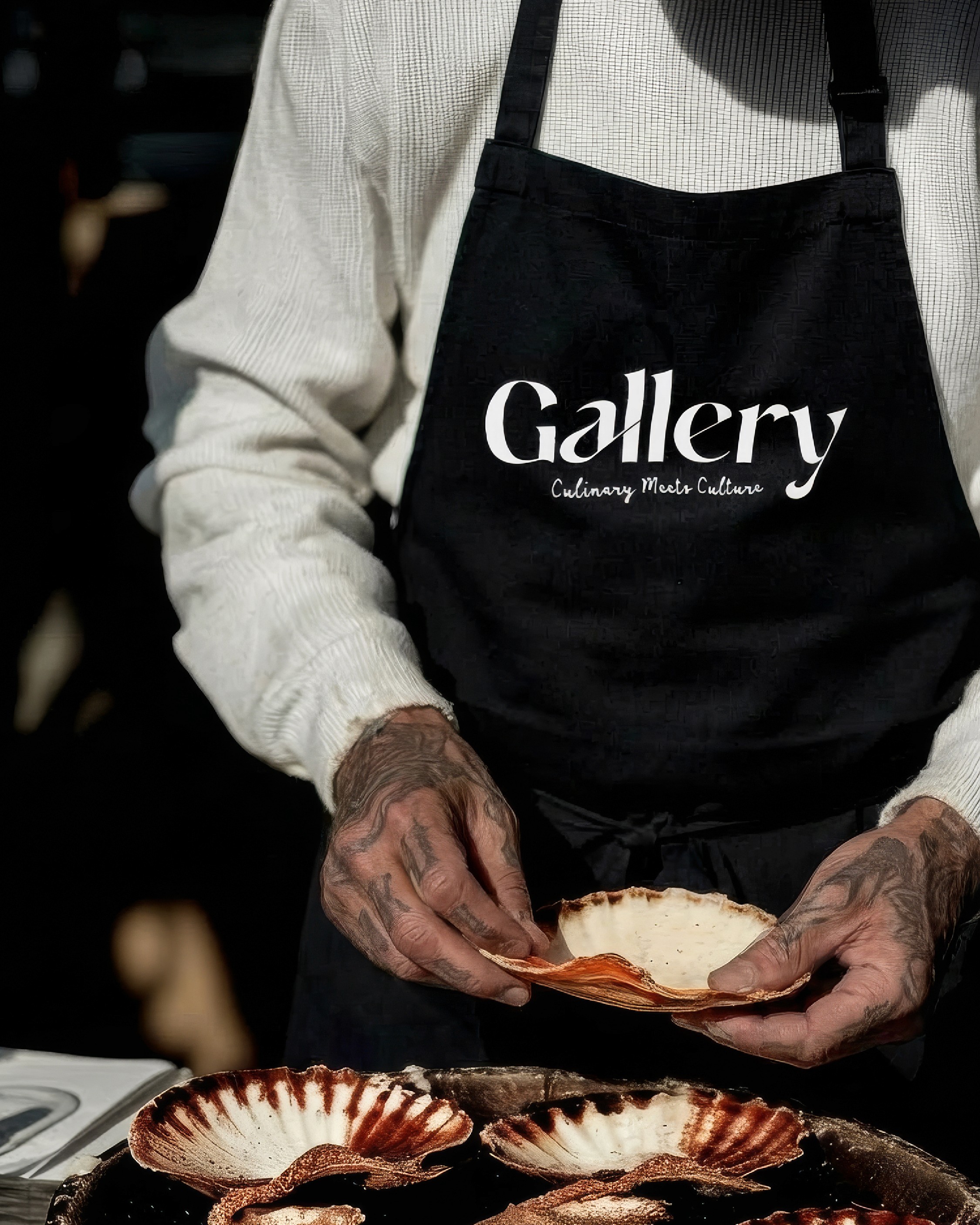
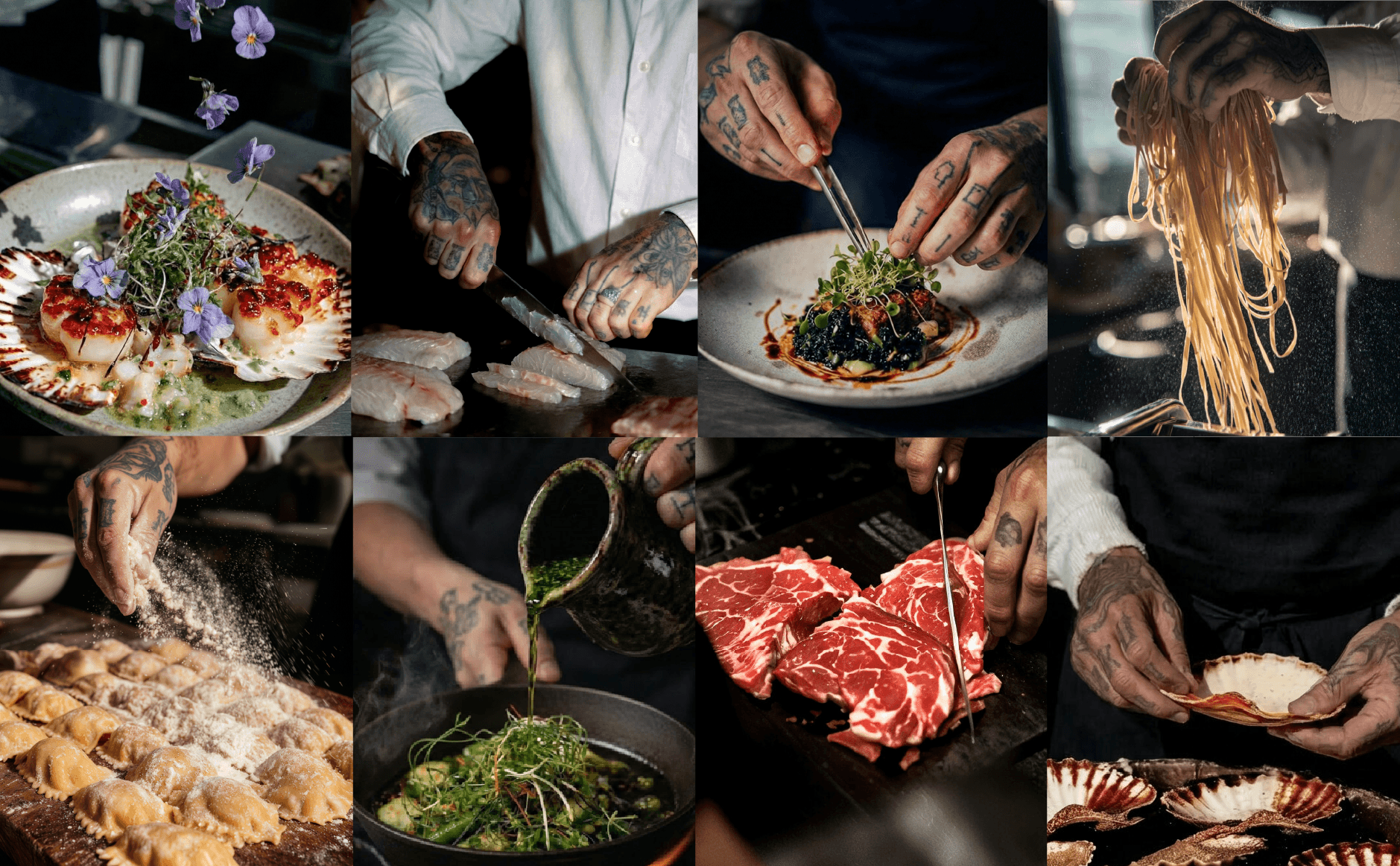
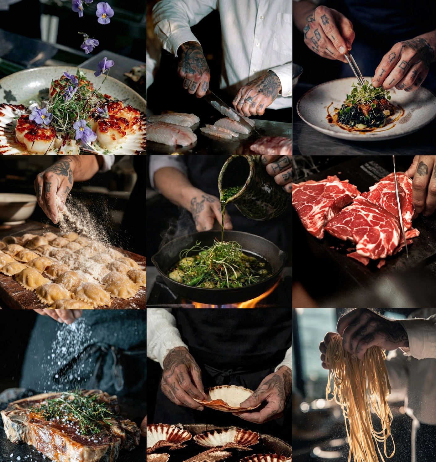
The photography focuses on the process. The hands, the cut, the exact second an ingredient becomes part of the plate. Just one dish, built in front of you, that will never be repeated the same way twice.
The photography focuses on the process. The hands, the cut, the exact second an ingredient becomes part of the plate. Just one dish, built in front of you, that will never be repeated the same way twice.
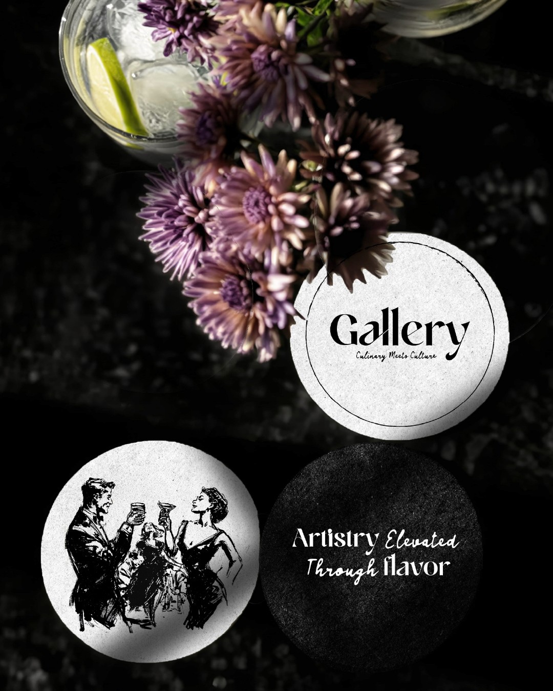
The palette is black and white, like the ink of the illustrations, so the food is the only thing on the page with real color.
For the color palette, we chose black and white to Give the stage to the food's colors and textures.

Social media showcases the process and artistry behind every dish, using the graphic language to blur the line between food and art. It reaches the people who look for creativity and authenticity.
Social media showcases the process and artistry behind every dish, using the graphic language to blur the line between food and art. It reaches the people who look for creativity and authenticity.
Gallery sorts its own guests. The people who want a rare, personal moment recognize it online, and the room delivers it the second they arrive.
Gallery sorts its own guests. The people who want a rare, personal moment recognize it online, and the room delivers it the second they arrive.