Erev is the kind of bar I want to walk into on a weeknight, where the bartender greets you by name, and the playlist feels like it was made by someone at the end of the bar. People coming in for a drink and ending up pulled into a conversation or a game at the next table. The food and drinks are good, but they are not the point. The point is the room, and how easy it is to feel part of it.
Erev is for the nights you show up in jeans, know the bartender by name, and the vibe feels like home. It is built for people in their 20s and 30s who want to meet new people somewhere warm, friendly, and real. The brand's job was to feel like that first easy hello, everywhere the bar shows up.
I started by thinking about the atmosphere I wanted to create. I pulled references that felt like the kind of place you can lean against the bar, talk with friends, maybe dance if the night goes that way. No matter who you are or where you come from, the space is meant to make everyone feel they belong, with a welcoming staff and a layout that encourages people from all backgrounds to connect and feel at home.
Erev is for the nights you show up in jeans, know the bartender by name, and the vibe feels like home. It is built for people in their 20s and 30s who want to meet new people somewhere warm, friendly, and real. The brand's job was to feel like that first easy hello, everywhere the bar shows up.

In the sketches, I played with shapes that reminded me of old matchbooks and neon signs. I wanted the logo to feel like something you already know, loose and a little playful.
Erev is for the nights you show up in jeans, know the bartender by name, and the vibe feels like home. It is built for people in their 20s and 30s who want to meet new people somewhere warm, friendly, and real. The brand's job was to feel like that first easy hello, everywhere the bar shows up.
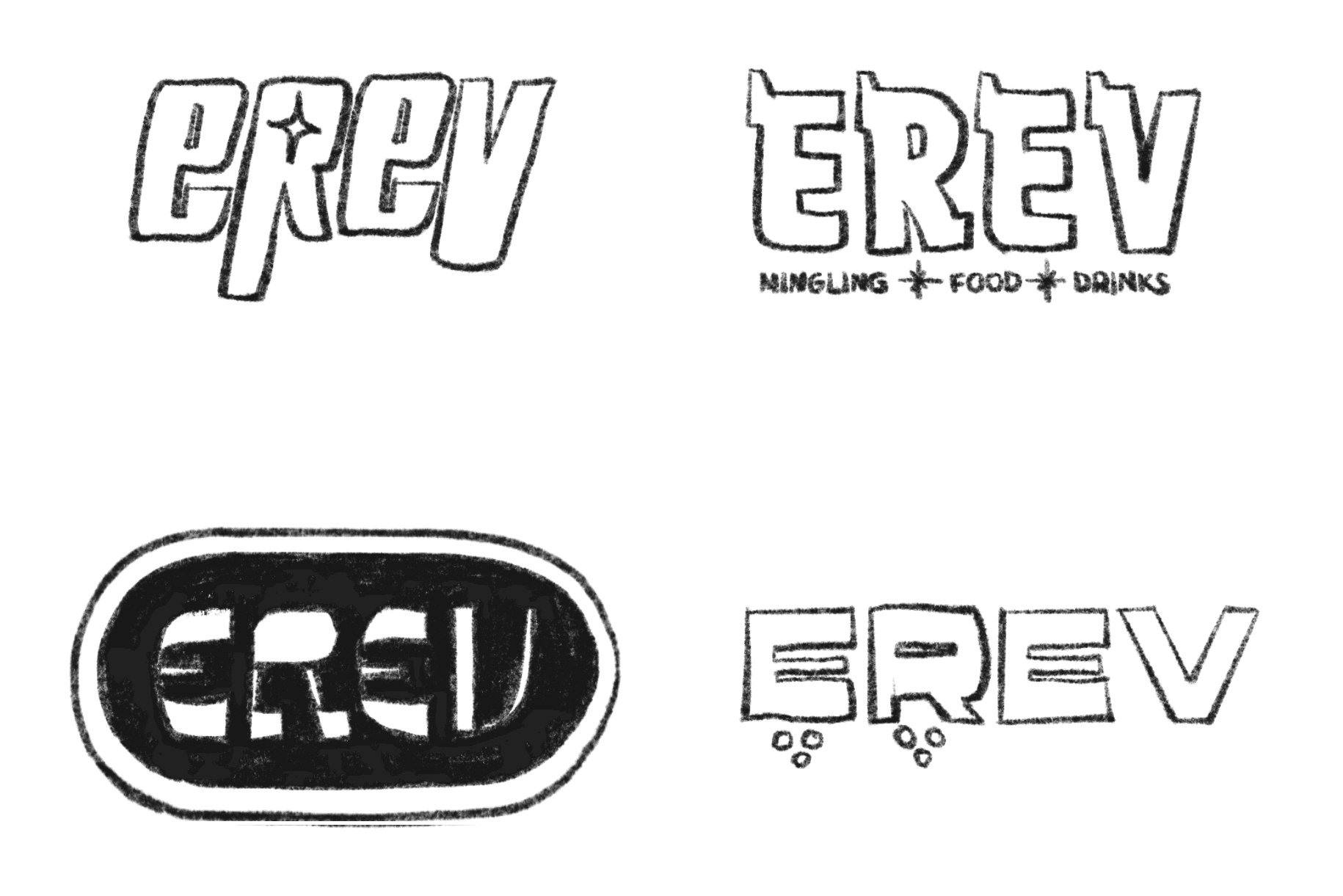
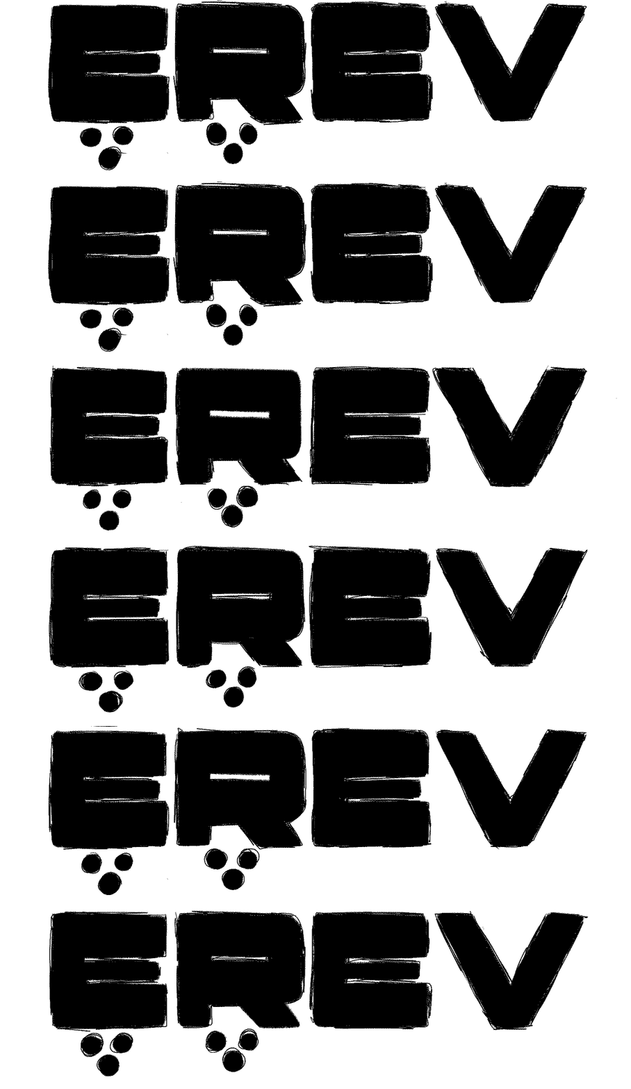
The logo is minimal type with a nostalgic, hand drawn feel. Loose, imperfect, effortless. It skips perfect and goes straight to confident and unmistakable.
A minimal type with a nostalgic, hand drawn feel. Loose, imperfect, effortless. It doesn't commit to perfect, but it's confident and unmistakable.
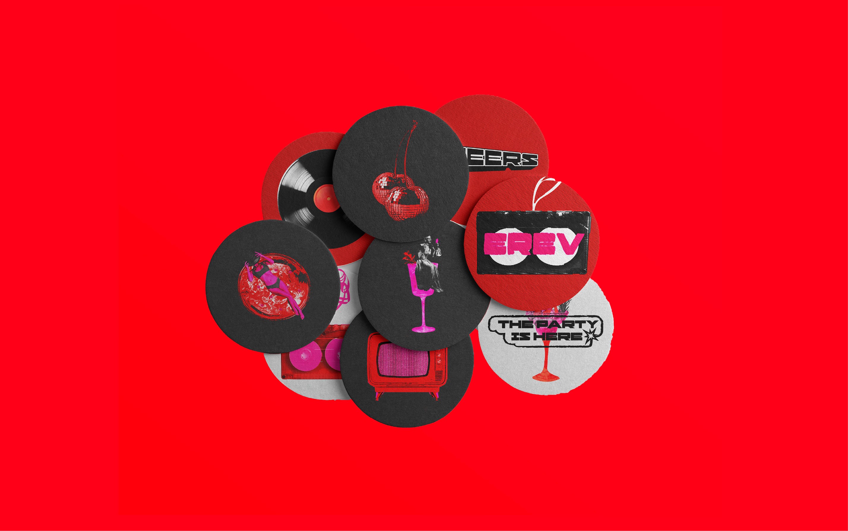
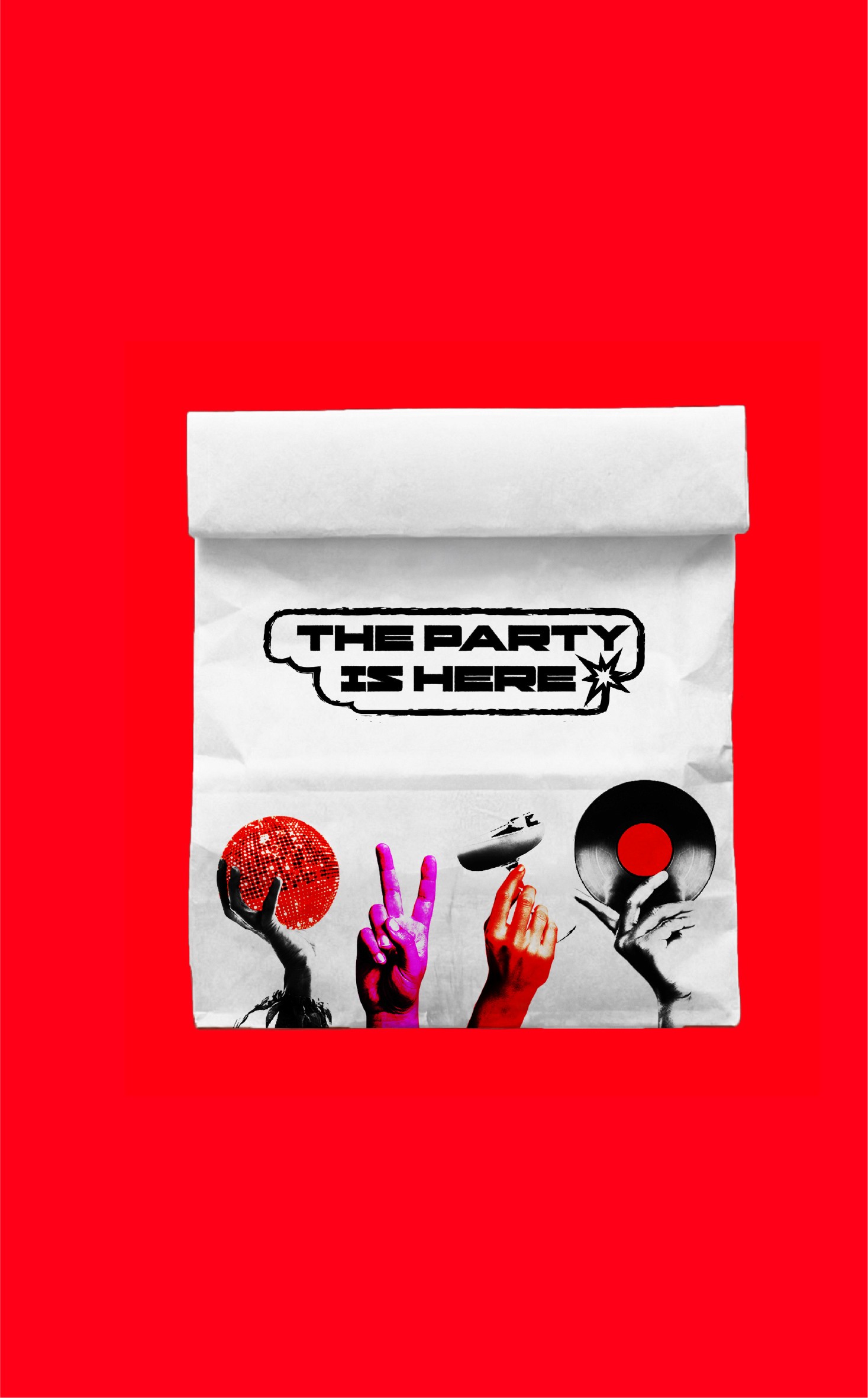
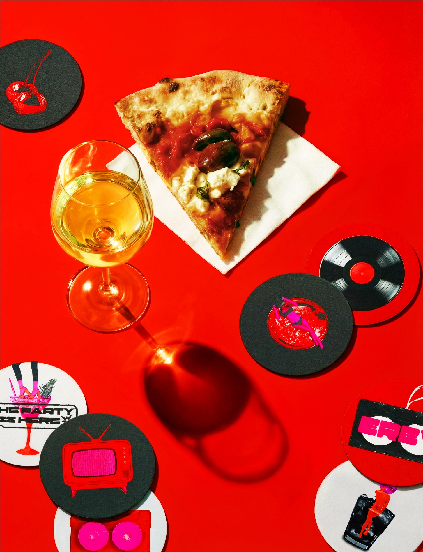
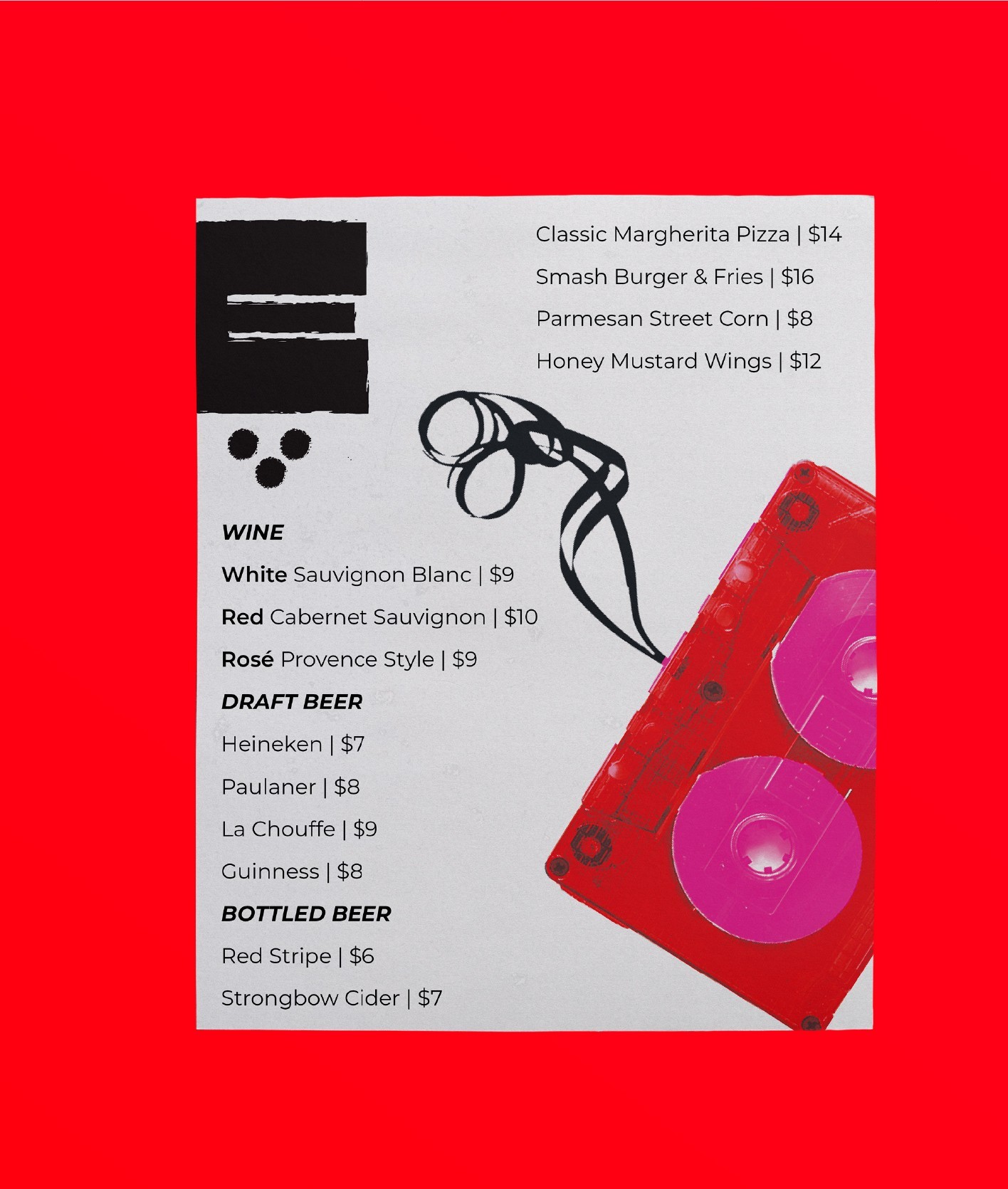
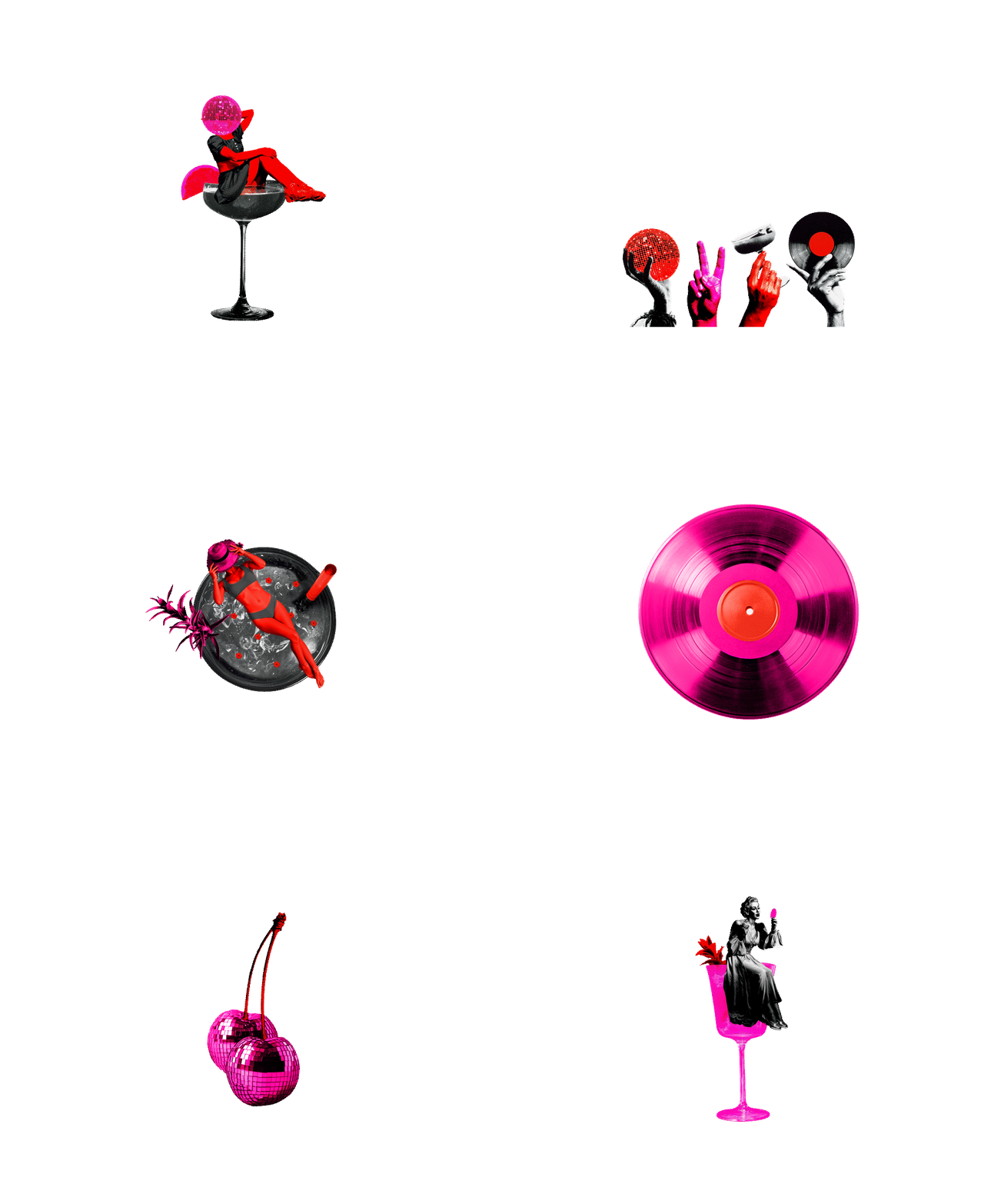
For the visual language, instead of building a feeling from nothing, I leaned on nostalgia, on elements people already connect with warmth and comfort.
Strong colors and a collage feel make it all look alive and lit
For the visual language, instead of building a feeling from nothing, I leaned on nostalgia, on elements people already connect with warmth and comfort. Strong colors and a collage feel make it all look alive and lit
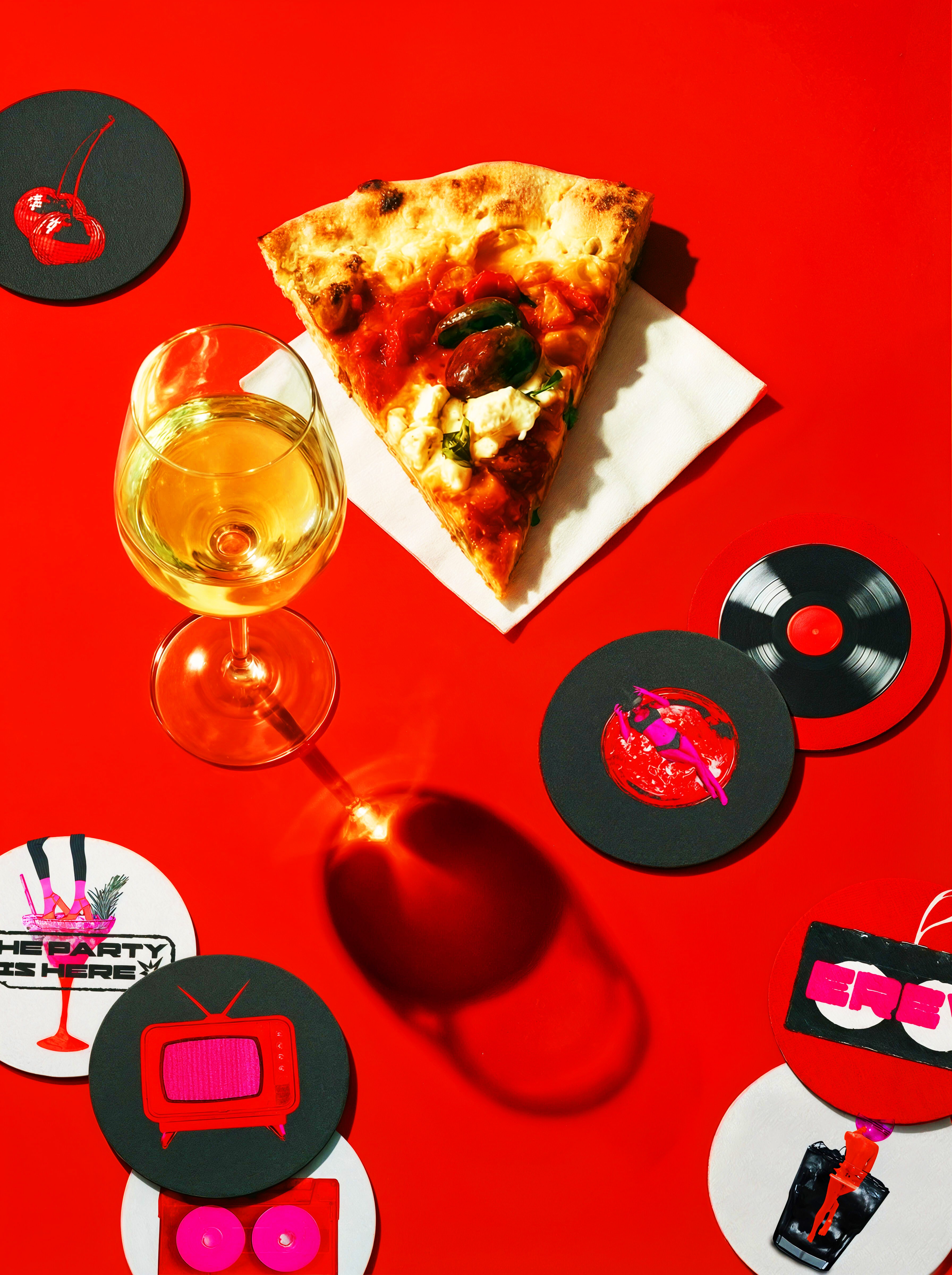
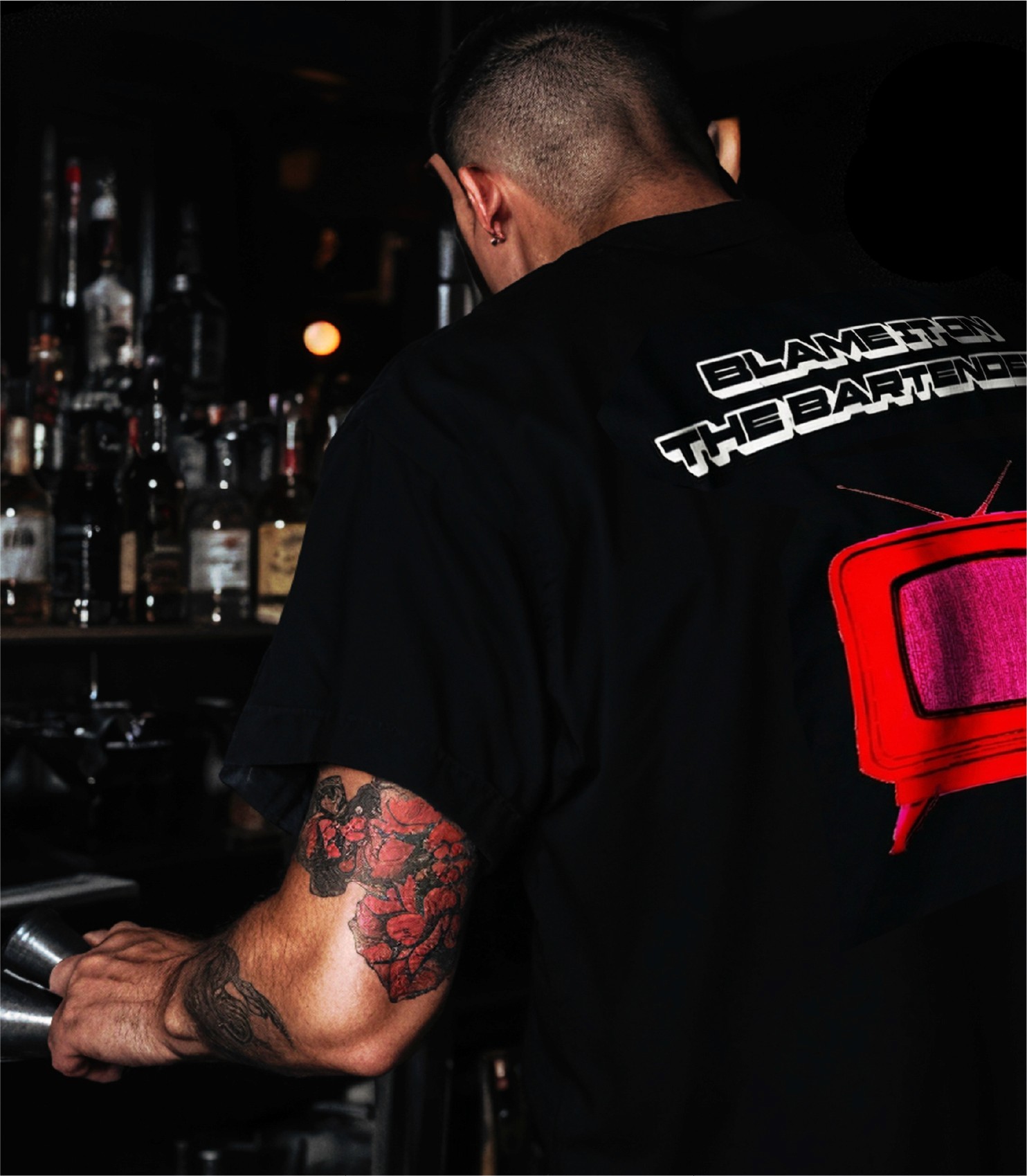
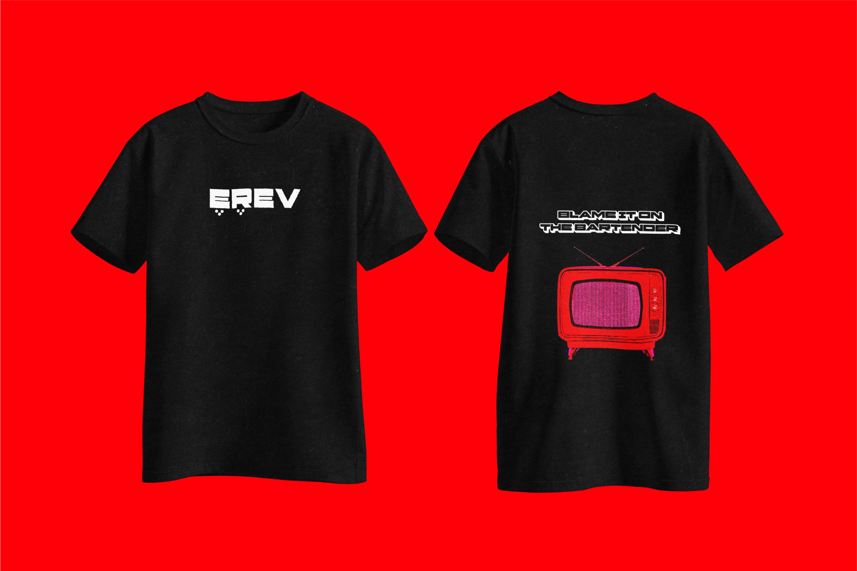
The type is big and a little loud, the kind of lettering you’d see on a T-shirt or a sticker someone actually wants to take home. I used phrases that sound like something you’d shout across the bar or text to a friend.
The type is big and a little loud, the kind of lettering you’d see on a T-shirt or a sticker someone actually wants to take home. I used phrases that sound like something you’d shout across the bar or text to a friend.
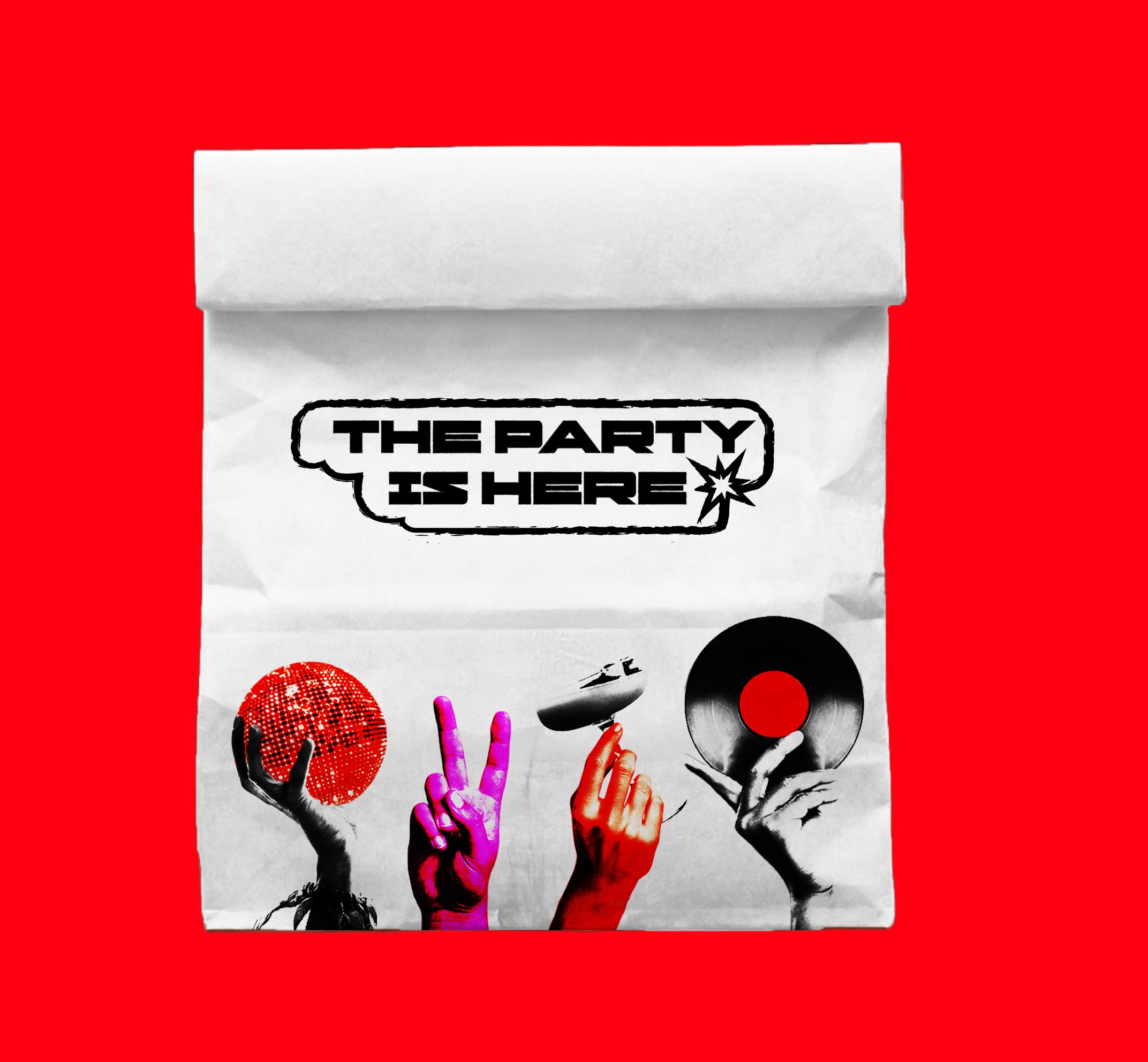
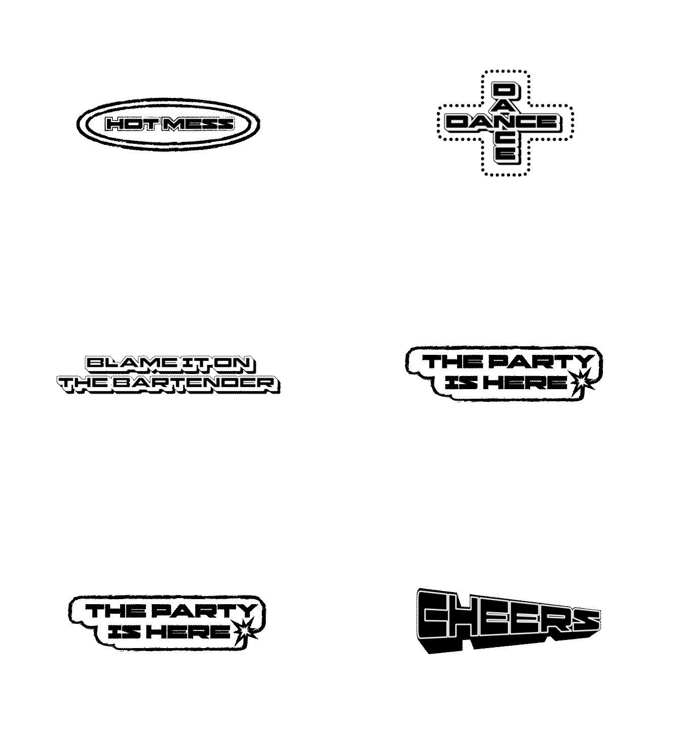
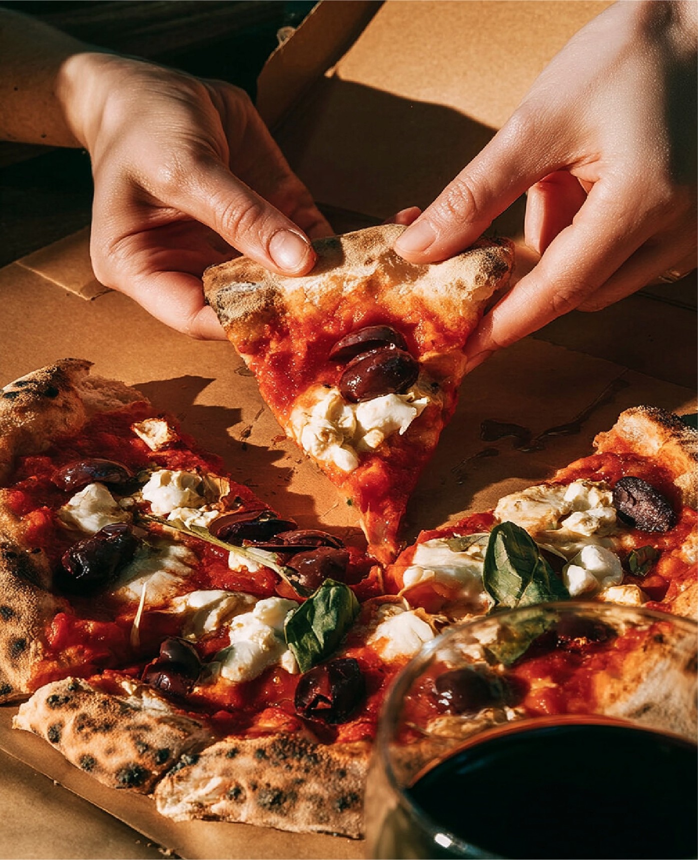
The photography is all about catching people mid-laugh, a hand reaching for a glass, a group squeezed into a booth. I want every shot to feel like you could have been there, or maybe you were. Even on a screen, you get that sense of being pulled into the table.
The photography is all about catching people mid-laugh, a hand reaching for a glass, a group squeezed into a booth. I want every shot to feel like you could have been there, or maybe you were. Even on a screen, you get that sense of being pulled into the table.


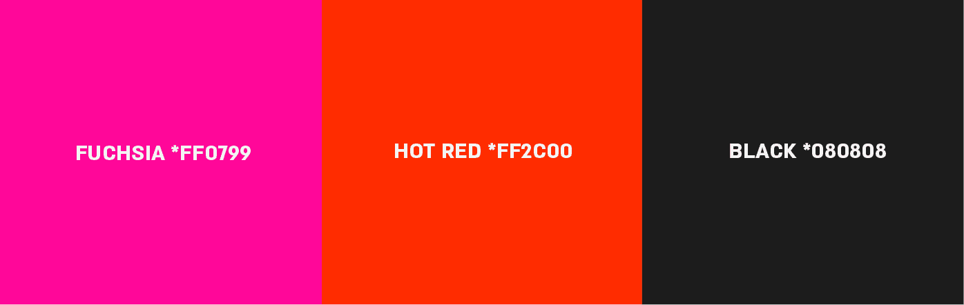
The colors are high energy and warm. Against the nostalgic elements, they add a young, current contrast.
The colors are high energy and warm. Against the nostalgic elements, they add a young, current contrast.
Social media blends real moments with energetic motion, built to make you feel the bar: the noise, the energy, the laughter, the crowd.
Social media blends real moments with energetic motion, built to make you feel the bar: the noise, the energy, the laughter, the crowd.